Coyote vs. Acme (2026)

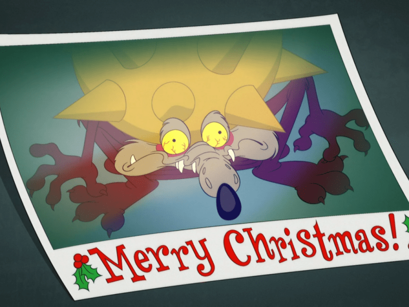
Certain characters are thought of as film royalty: Charles Foster Kane, Vito Corleone, George Bailey, Wile E. Coyote. Yes, Wile E. Coyote belongs among the stars as do Bugs Bunny, Daffy Duck, Mickey Mouse, Donald Duck, and an assortment of colorful, animated, characters that have delighted generations on screens big and small. Animated characters never die, their voice may change a bit here and there, but they endure unlike those fragile humans. And it’s because of my belief in the importance of these characters that I demand that they be respected like any other venerable film franchise. They should be celebrated, but for too long in the case of the Looney Tunes has Warner Bros. done the brand a disservice. They allowed these characters to fade away and become less important. There’s likely a generation of kids in the world right now who might not be able to identify these characters by sight and that’s a shame. Lately, there has been a small renaissance. MeTV and its offshoot MeTV Toons is a broadcast channel that makes classic cartoons part of its regular programming. The Day the Earth Blew Up had a modestly successful run in theaters this past year, and Warner even tried its hand at the Space Jam game again. And here to help further that revival is Coyote vs. Acme.

Or, it nearly didn’t. If you’re reading this then by now you’re likely familiar with the story of Coyote vs. Acme. Based on a 1990 article in The New Yorker by Ian Frazier, the film was pitched to Warner by producer/director James Gunn in 2015 and officially went into development in 2018. Dave Green was hired to direct and Will Forte and John Cena were cast as opposing lawyers for the film, one representing Wile E. Coyote and the other Acme. The film was shot, edited, and set for release on July 21, 2023, but a late change meant the film gave up its slot to Barbie and a rescheduled date was not forthcoming. Then in November of that same year word came out that Warner Bros. Discovery was planning on shelving the film choosing instead to take a tax write-off estimated to “save” the company around $30 million. Movies and television shows get cancelled all of the time for various reasons, but in the case of Coyote vs. Acme the film was done. It was complete. Warner had spent around $70 million on the project, but felt a write-off was worth more to them than whatever profit the movie was likely to make. It was especially painful for those who worked on the film because it screened well with test audiences, anyone outside of the production who saw it had nothing but good things to say, and there was really no reason not to give a movie like this a fair shot. It was pure corporate greed and an insult to the Looney Tunes and Hollywood (as well as the general public) took notice.

It only took a couple of days for Warner to go back on its word and instead opted to pursue selling the film instead. When February rolled around and Warner had rejected all offers, it made people question if they were serious or not or if this was all charade to make them look better before eventually hitting the delete button on a finished film. Finally, in March of 2025 it was reported that Ketchup Entertainment had secured the rights to the film for roughly $50 million. Ketchup, as you may recall, is the company that rescued The Day the Earth Blew Up which could have met a similar fate. Ketchup was apparently happy with that investment and was willing to spend money on a Wile E. Coyote movie. I don’t know how that is going to work out for them when it comes to the dollars and cents, but from an artistic standpoint the move has been an explosive hit.

If you have seen even one Road Runner/Wile E. Coyote cartoon then you know this isn’t going to work out well for the coyote.

Coyote vs. Acme is the story of one coyote and his quest to eat a bird, and not just any bird, but the Road Runner. However, standing in his way has been the tools provided by the Acme Corporation which seem to always blow up in, on, or around his face. Wile E. Coyote makes his way into Albuquerque, New Mexico to enlist the aid of a small claims lawyer by the name of Kevin Avery (Will Forte), he of the law firm Avery, Jones, & Maltese (brilliant). Avery is the kind of lawyer who looks to eke out a living suing massive corporations like Acme for extremely small sums. He sees Wile E. as a similar candidate and thinks he can get him a couple hundred bucks, but Wile E. circumvents him and the pair end up suing Acme for several millions. Buddy Crane (John Cena) is the hot-shot lawyer for Acme who went to law school with Avery and knows he’s a failure. Confident he can get a settlement agreed to, Avery is more than willing to go along with such, but his client refuses forcing the issue to trial. It’s David vs. Goliath with the fate of Avery’s firm on the line so the stakes are fairly large. And lurking in the backgroun is a secret operation at Acme, Project Sisyphus, uncovering the origins of which may put Avery and his niece clerk Paige (Lana Condor) in legitimate danger.

The big guy vs. little guy plot is probably strong enough to carry the film, but the sordid details, mysteries, swerves, and an escalation of the trial itself really helps to fuel the plot and keep it engaging all the way through. There are some solid dynamics with Kevin and Paige who as a recent law school grad has an idealized version of what a lawyer can and should be while her uncle embodies all of the bad stereotypes. What also helps push things along is the character development between Kevin and Wile E. Coyote. Given one is played by a human actor and the other is a mute cartoon, that’s a bit surprising, but the two play off each other really well. There are some legitimate heartfelt moments between the two and if you’re the sort of person who never felt sympathy for the coyote then you will here. I was never one of those people. I always rooted for the coyote. Cena’s buffoonish turn as Buddy Crane is the perfect foil for Avery and also along as the head of Acme is Foghorn Leghorn (Eric Bauza) who makes for a natural villain as well. He’s played a bit like his role in The Looney Tunes Show where he was a mayor there. A loud-mouthed schnook like him is perfect as a C.E.O. or politician.

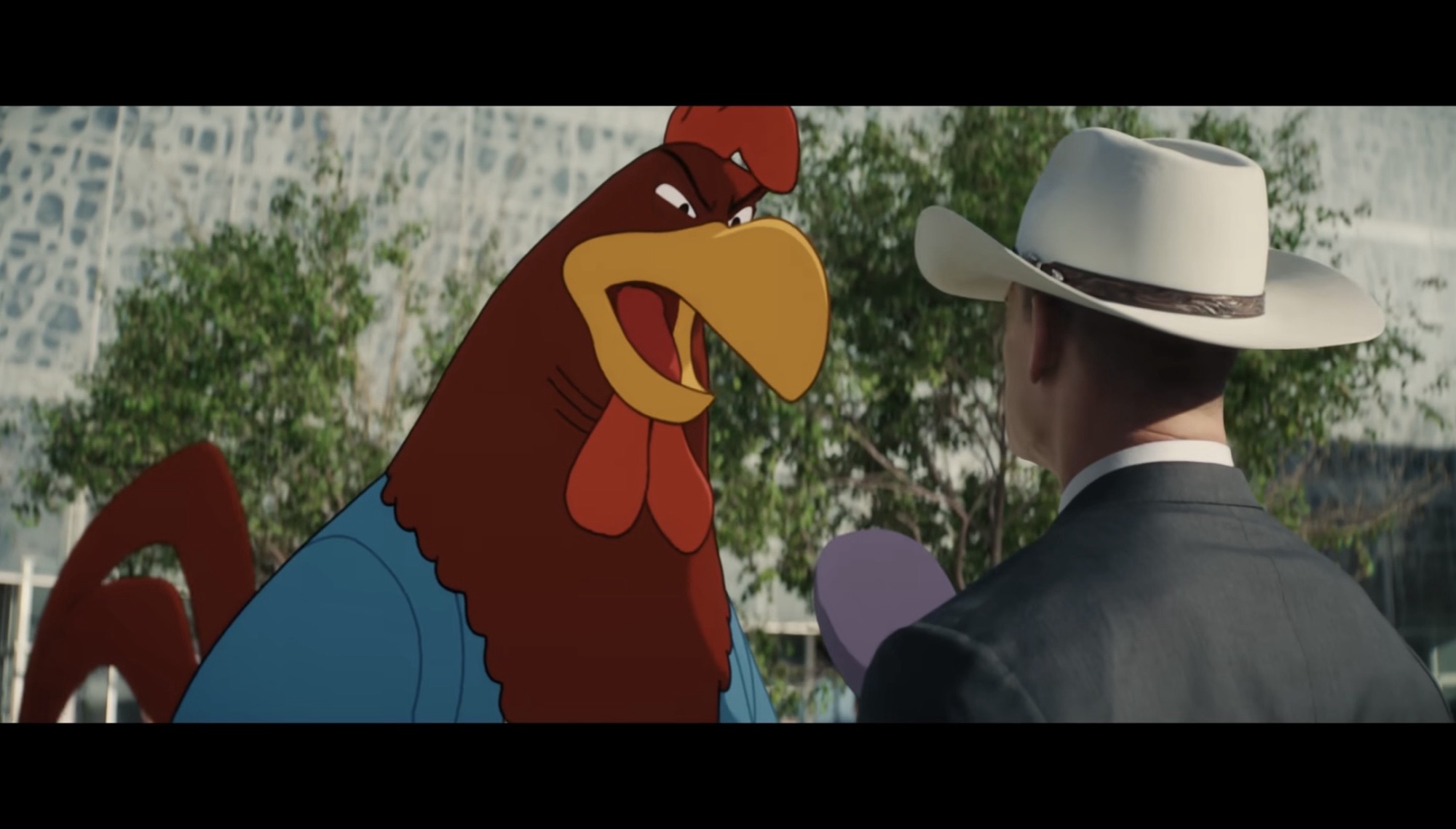
I was pleasantly surprised by the visual effects, but if one character looks a bit “off” it’s Foghorn Leghorn.

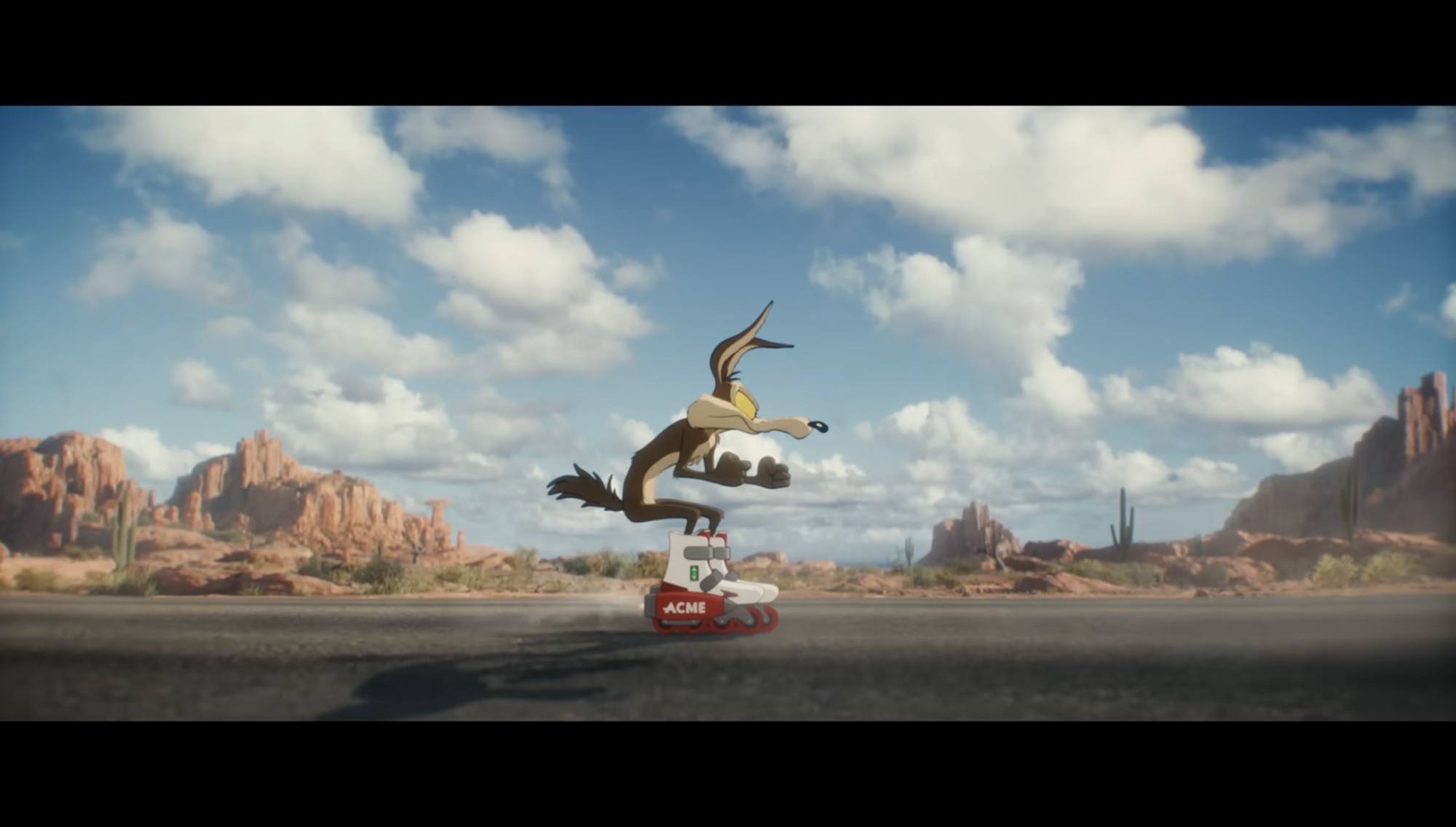
The film is a live-action animation hybrid and as such is going to invite criticisms to past Looney Tunes movies like Space Jam as well as much better movies like Who Framed Roger Rabbit? The movie is less interested in cameos than both of those, but there are still plenty as this is a world where humans and cartoons interact with regularity as part of day-to-day life. DNEG and Duncan Studios provided the animation to bring these characters to life. Most have a 2D appearance, but they’re clearly 3D models and some are more obvious about it than others. The rather bulbous Foghorn Leghorn moves like a big, CG, ball and has a bit of a video game quality to him. As far as films go, it reminded me of the Rescue Rangers movie in terms of quality. For a character like Wile E. Coyote, the effect was less noticeable. Fairly early in my viewing I stopped paying attention to the visual effects where the coyote was concerned and instead was viewing him as another character. He works wells with the human actors and doesn’t look out of place in most shots. There are, of course, plenty of special effects shots designed to play with the hybrid nature of the film and pretty much all of them work very well. There’s a big action set piece towards the climax of the film that probably accounted for a sizable chunk of that $70 million budget and it’s pretty spectacular. This film isn’t going to rival some of the hybrids that came before it, but the visuals were a modest surprise for me and it didn’t come across as some lesser version intended for streaming or something.

The sound design for the film is also very well done with all of the bangs, explosions, and musical stings one would expect of a Looney Tunes movie. Eric Bauza is on-hand to voice many of the characters he’s inherited over the years and there are also a couple of surprises I won’t spoil. Steven Price composed the film’s score and he understood the assignment. Archival sounds for Road Runner’s classic “Meep Meep” were utilized rather than redone and if you listen closely you will hear from Mel Blanc in this one. The non Wile E. Coyote characters are also utilized well. Porky Pig is kind of a schmuck who has been a client of Avery’s multiple times. Gossamer is the one who delivers subpoenas and the always eager to help Charlie Dog is an employee of the firm. Not every classic character makes an appearance, but chances are you will see your favorite with only a couple of notable exceptions. I also have to give a special shout out to Candi Milo who continues to kill it as a modern day June Foray.

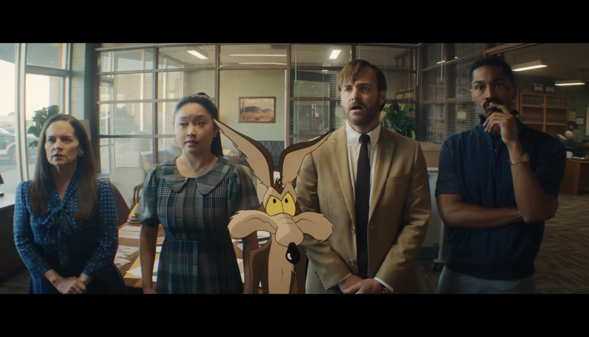
He may not have enlisted the best, but this legal team is probably as good as it’s going to get for Wile E. (L to R): Martha Kelly, Lana Condor, Wile E. Coyote, Will Forte, Tone Bell

It’s rather interesting that a film like Coyote vs. Acme in which an aggrieved party tries to get justice by going toe-to-toe with an all powerful corporate entity was the film nearly destroyed by a similar entity in the real world. The parallels are uncanny and if the executives at Warner Bros. Discovery had any sense they would have seen that right away and opted not to pursue such an avenue with such an obvious film. Acme may be the bad guys of the film, but it reads like a stand-in for the parent company itself. It’s also quite clear that none of them watched the movie before coming to such a decision, and if they did then they not only lack any sense of taste, but also have no appreciation for the characters that built this legendary studio they all grow fabulously wealthy via. Warner Bros. is currently for sale and may very well get sold in the next calendar year as the media landscape in the United States further consolidates into a small handful of conservative voices. Who knows what our entertainment will look like following such, but at least Coyote vs. Acme managed to escape before all of that happens. The movie is legitimately funny and especially so for those who grew up loving the Looney Tunes. It is so much better than Space Jam or Looney Tunes: Back in Action and it feels like the squad finally has that live-action, animation hybrid it deserves. If you have a chance to see this one in theaters I highly recommend it. I was pretty sure I was going to have a solid time with it when I bought my ticket, but it exceeded my expectations in every way. My entire family walked out of the movie, including my daughter who clung to her ratty, old, Bugs Bunny plush throughout the whole thing, feeling that we had just watched the best Looney Tunes movie ever. Hopefully, it won’t be the last.

For more from the Looney Tunes, check these out:

The Day the Earth Blew Up: A Looney Tunes Movie

For all of the success the cast of Looney Tunes have had on the silver screen, it’s rather surprising that they have never been given the chance to helm a feature in their native medium. Sure, we had Space Jam and Looney Tunes: Back in Action, but both were live-action/animation hybrid films with one of…

Keep reading

Lego 71030 Looney Tunes Minifigures

When it comes to classic cartoons, few would argue against the merits of Warner Bros Studios’ Looney Tunes. Pretty much all of the major studios were invested in cartoon shorts in the 1930s into the 1960s and Warner was a gold mine for hilarious content. The Leon Schlesinger produced Merrie Melodies and Looney Tunes churned…

Keep reading

Dec. 23 – Bugs Bunny’s 24-Carrot Holiday Special

Let’s try this one more time for 2023 – can we find a good Looney Tunes Christmas special? And more importantly, a good Bugs Bunny one? We’ve looked at two already that were merely okay. Nothing terrible, but hardly holiday classics. For our final go at this, I’m feeling a little more optimistic and that’s…

Keep reading

Marvel Legends X-Men ’97 Professor Charles Xavier with Hoverchair

I never thought we’d get this in plastic.

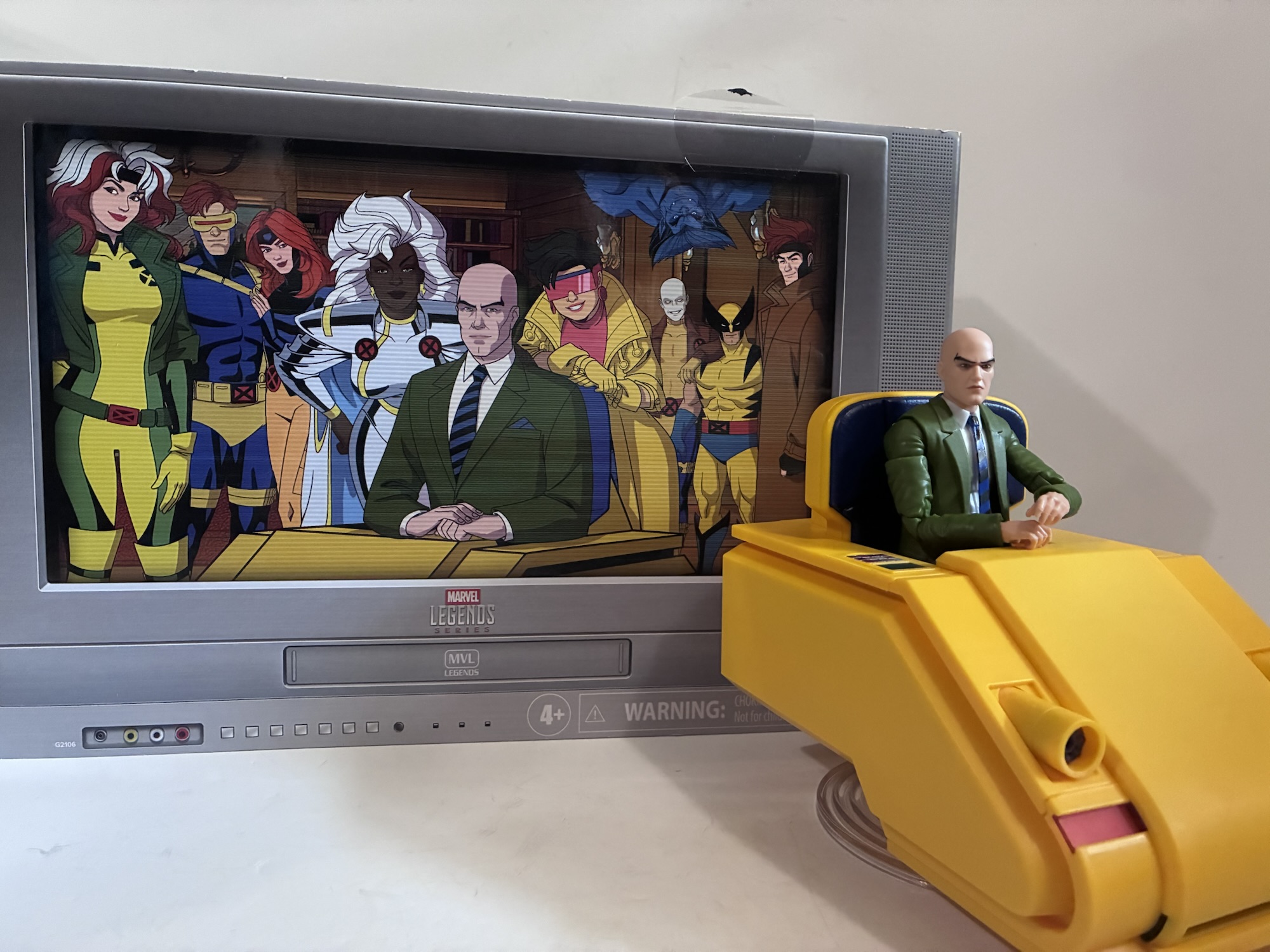
The second season of X-Men ’97 may be over, but we still have more on the way to talk about starting with this year’s Marvel Legends San Diego Comic Con exclusive. It was just over a year ago that I reviewed the reissue of the Charles Xavier with Hoverchair based on his appearance in the comic books. At the time, I decided to grab that figure because I wasn’t convinced Hasbro would ever give us a toon accurate version of the character and chair. I figured, at best, they’d just reissue the existing chair again, but maybe in a brighter yellow. How wrong I was. Announced as an exclusive for San Diego Comic Con this year was the Professor Charles Xavier with a screen accurate hoverchair to go with it. I honestly didn’t see that coming even though I know that the X-Men ’97 figures have been pretty successful for Hasbro. Since I had no plans to attend San Diego Comic Con this year (or any year) I was going to be at the mercy of what Hasbro did following the event which leads me into the following tangent.

The comic con exclusive goes back many years. I have no idea when it started, but I can remember reading about them in Wizard back in the 90s. They are to be expected and in this day and age most of them aren’t true exclusives since they’re sold online. Still, last year Hasbro did a Marvel Legends three-pack featuring a reissue of Sauron, Rogue in her Savage Land attire, and a new version of Shanna the She-Devil. Rogue had never been depicted in that look before so there were plenty of collectors interested in the set for that. Sauron was previously a build-a-figure so the chance to get him in a three-pack was also tempting for some. Shanna was a brand new character for Legends and paired very nicely with the recently released (at the time) Ka-Zar and Zabu which made the set really desirable for a lot of fans. Hasbro wasn’t willing to meet demand and few non-attendees were able to get a set when it went up for sale on Hasbro Pulse following the event. I wasn’t personally interested, but I know many collectors still sore about it. The prospect of the same happening with Chuck did not give me much confidence and it leads me to my main criticism when it comes to exclusives: they shouldn’t be essential to a collection. Rogue in a one-off look? Sure. A reissue of Sauron? That’s fine. A somewhat goofy, deep pull like Death’s Head? Bring it on! A main character from a hit show in his most recognizable and iconic look? What?! No!

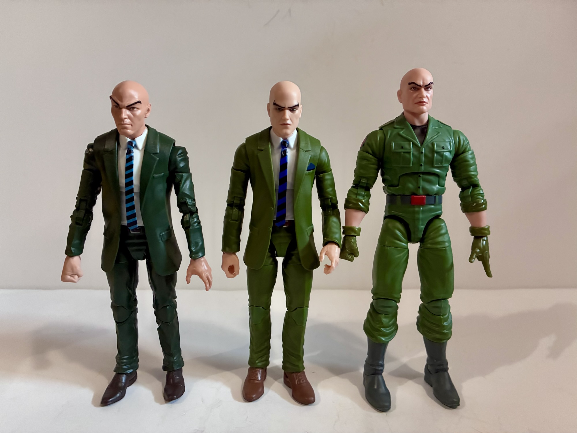
Chuck sure likes green.

Professor X in his green suit should be an easy figure to acquire. He should have been a regular retail release. Did retailers pass on him? Maybe, but I doubt it. I don’t think any are sitting on much X-Men ’97 stock so the chance to have another character to sell while the second season was in full swing would probably be pretty appealing. That’s not what happened, and when reports surfaced that Xavier sold out at the event I wasn’t feeling too good about getting one myself. Then Hasbro changed how they do things when it comes to Pulse. For their storefront, fans can pay Hasbro an annual sum for the privilege to buy stuff from them. The perk being they get free shipping, but also first crack at exclusive products. In previous years, that meant a one hour headstart on the general public, but this year that one hour was turned into twenty-four. If Premium members were getting a full day all to themselves to buy product what chance did I have? I wasn’t about to hand Hasbro another fifty bucks for Charlie so I let it ride, and to my surprise it all worked out. Xavier was there the next day and remained available for at least an hour. That may sound like a quick sell-out, but when it comes to exclusives that’s a pretty generous amount of time. They also opened up preorders following that which is what should have happened with the Savage Land set the prior year. They did that for basically every other brand exclusive so I don’t know what the issue there was. Hasbro made a silly decision in making Professor X an exclusive, but at least they had the foresight to make enough and keep him available past that for a little while longer.

“Admit it: you’re jealous of my blankie.”

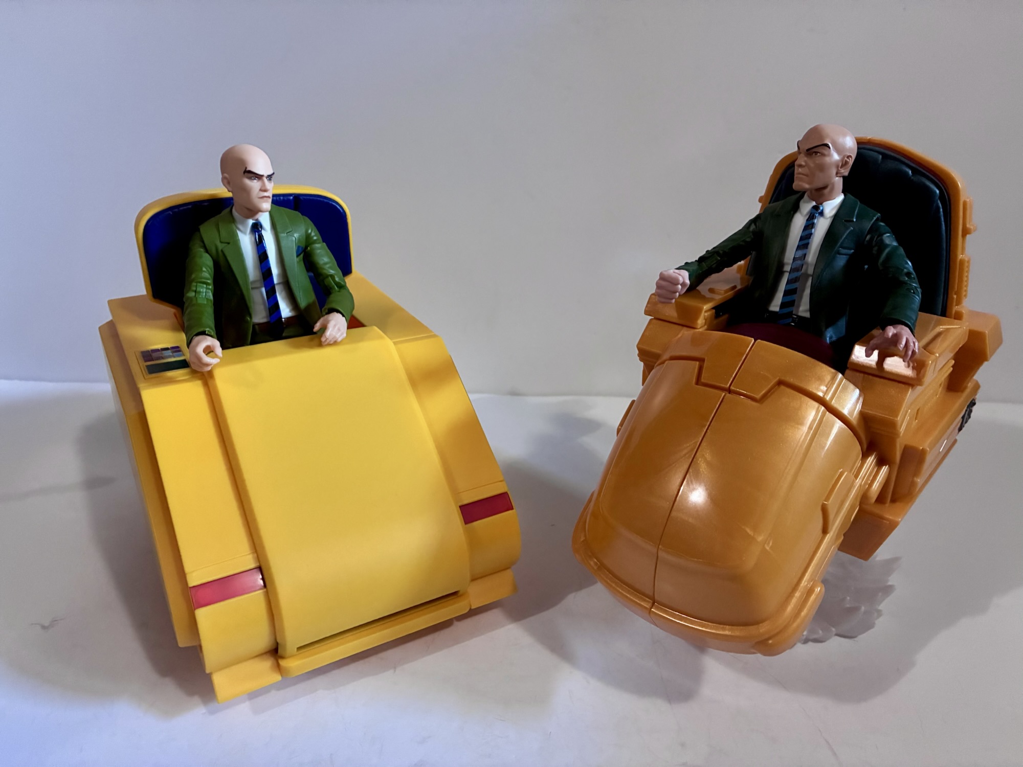
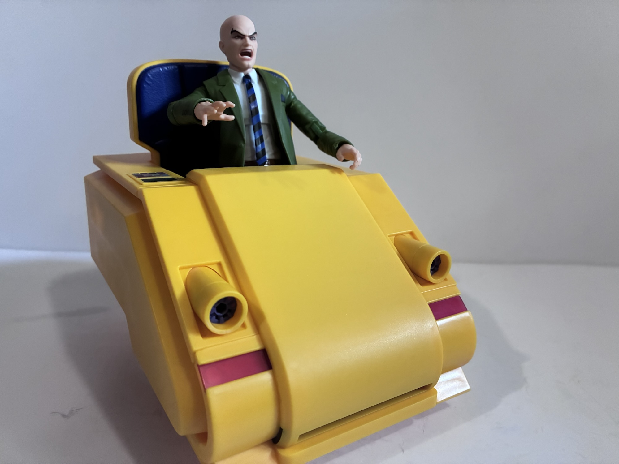
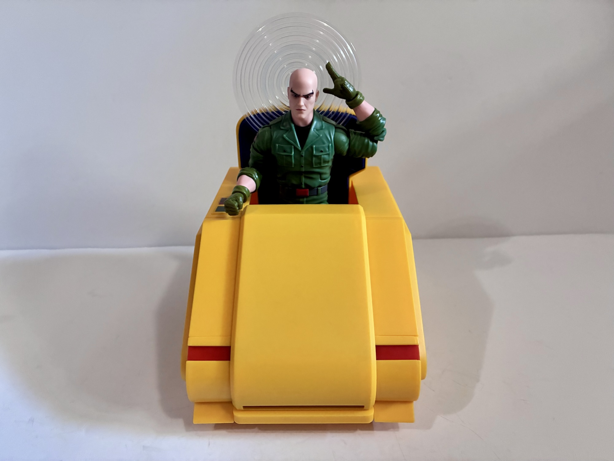
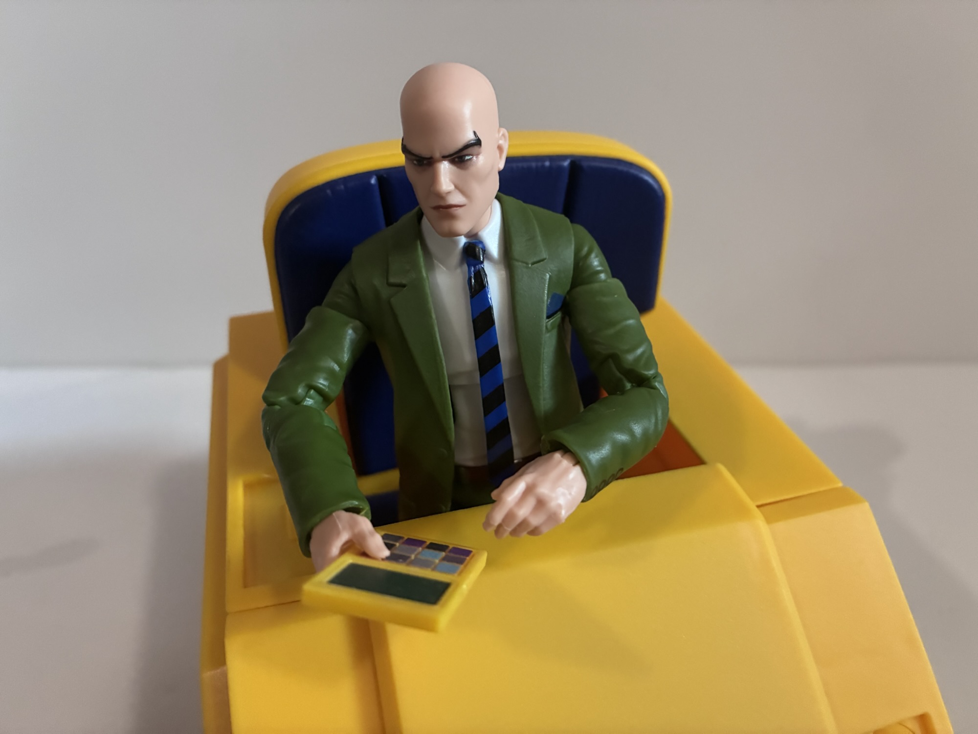
As for the release itself, it’s probably what you expect. The main draw is the chair. In the show, the chair was always blockier, usually very yellow in appearance, and quite sleek. The comic version is more narrow, bulbous, and just all together a different shape. I have no idea why the animated series changed it up, but I’ve always preferred this look to the comic one. And it’s never made it to plastic. Even the old 90s Toy Biz figure featured a chair with the comic design even though that toy line was loosely based on the cartoon. And for this release, Hasbro got it right. It’s the right shape, the right color, has some nice accents on it, and doesn’t feature any unsightly seems anywhere like the older chair. The only assembly required is the seat back has to be inserted and it features a far more understated flight stand that’s just transparent plastic with some concentric circles on it. It’s simple, but it looks the part and that’s all that is needed. The only nitpick I have is it’s a little hard to get a figure into it. If the front panel could pop off it would make it a lot easier, but it’s not like it’s impossible. Plus, Legends figures aren’t covered in paint so it’s not as if you have much to worry about when it comes to paint rub.

I lead with the chair because it’s the star of the show, the actual figure is just fine. Professor X “stands” at about 6.125″ to the top of his bald head. He’s the same height as the older figure and much of the sculpt is also the same. The torso and jacket are reuse while the arms and legs were redone to make them pin-less. The sculpt for both is all new as the wrinkles and seems are different. The arms also dropped the buttons at the ends of the sleeves in favor of just painted on ones which was a bit of an odd choice. The feet are the same while the hands are new. If they’re from another figure I don’t know, but they’re not of the old one. The head is obviously new and this one does resemble the character from the show. It’s a stoic expression and looks good, but it also looks pretty big on the body. This body is very slight. That works for some takes on Xavier, but not really the animated one. He’s built like a house in the show which isn’t captured here. I wish they had gone with one of their bigger suited bodies with broader shoulders, but they probably wanted to reuse this torso with the correct tie on it. They at least did a good job of getting all of the greens to match. There’s not a lot of paint to be found on here, but what’s present is neatly applied.

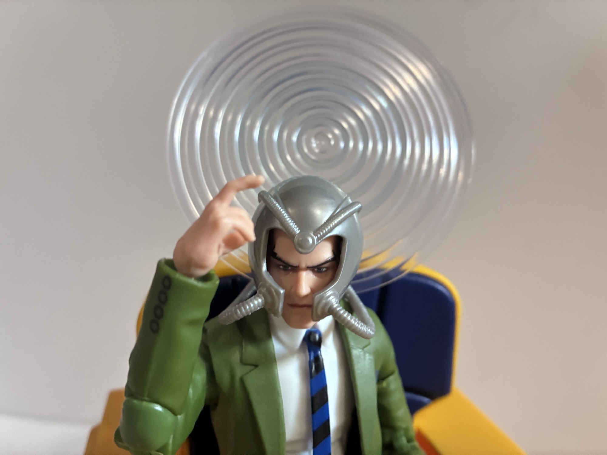
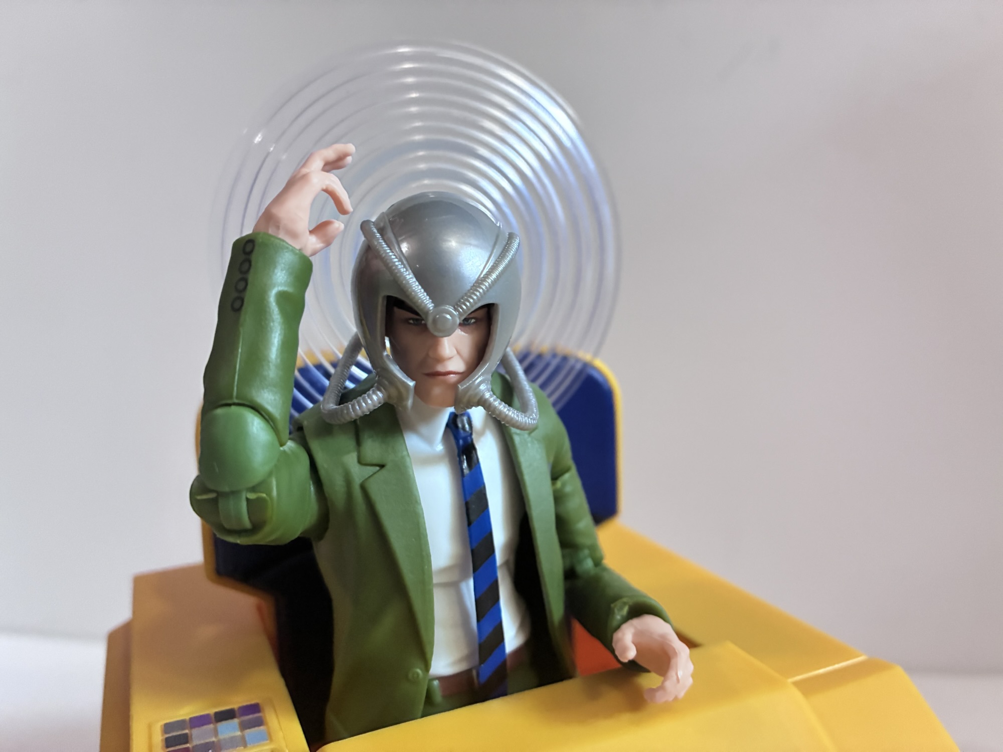
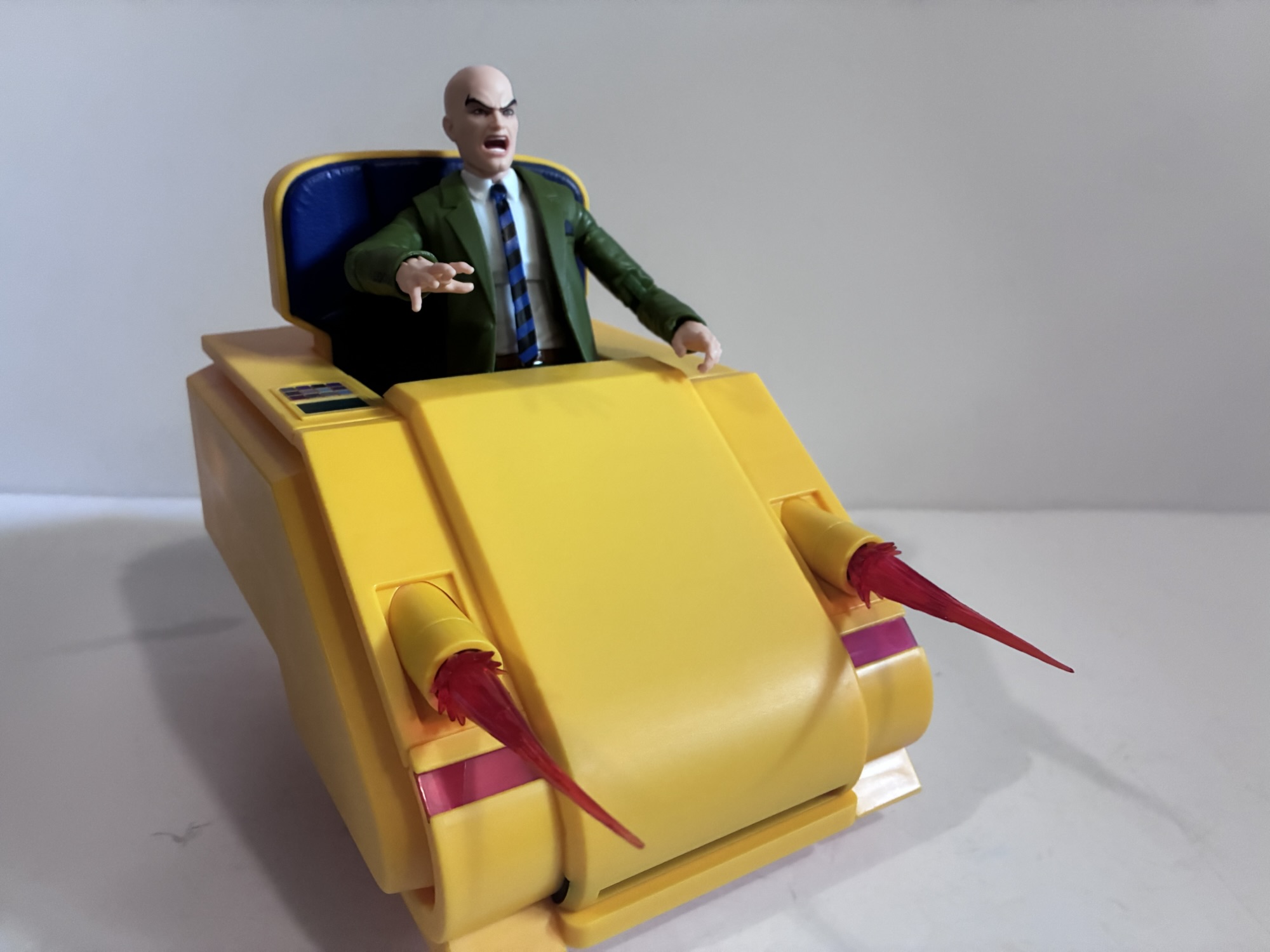
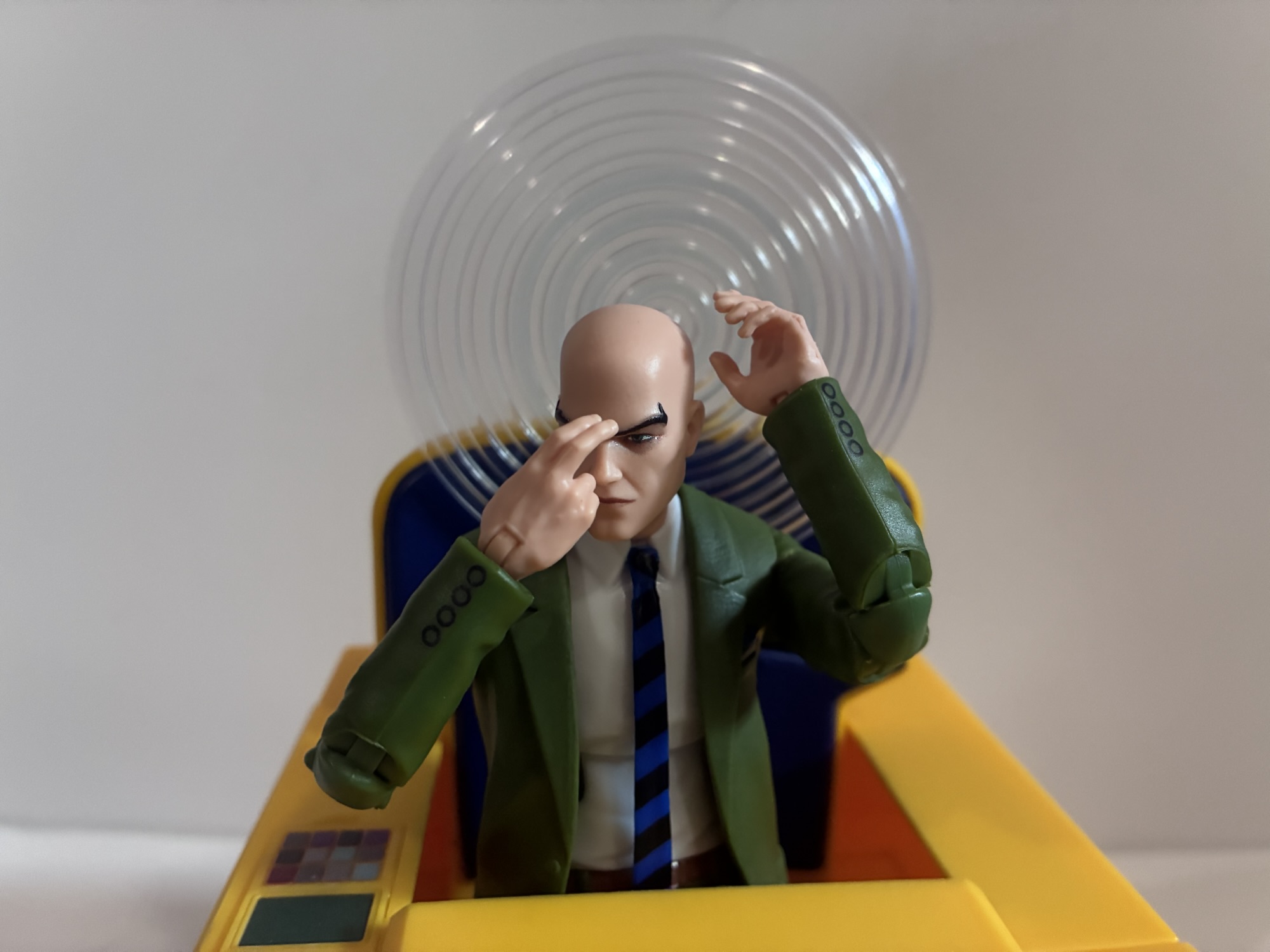
What’s unfortunate is the small frame looks more out of place when Charles is placed in his chair. He could get lost in this thing which is noticeably bigger than his old one. At first I thought maybe it was the chair that’s too big, but then I stuck the Savage Land Xavier in it and he looks great. That’s a bigger sculpt and he fills out the chair quite well. The heads from this set also fit that body which is nice. And speaking of, there are two portraits: stoic and yelling. The yelling one works for a more aggressive Xavier, though I wish we got a third one featuring a smile (this is a $50 set, after all). The other accessories include two sets of hands: open and gripping. The gripping hands are asymmetrical as one is intended to grip the included keypad which pops out of the chair’s right armrest. He can hold that with his right hand and the left gripping hand is a touch more relaxed like he’s punching something in on that keypad. There’s also an extra right hand with a two-finger gesture that stands in as his mental powers gesture for reaching to his temple. The same Cerebro helmet from the Savage Land figure is also featured here and now we can see why there’s a hole on the back of it as there’s an included power effect. It’s a large, transparent, circle with sculpted circles throughout it. I think this was released with a Daredevil in the past and it works as a physical manifestation of his power set. It can not only plug into the helmet, but there’s also a hole in the chair back for it too which works well should you not want to utilize the helmet. When plugged into the helmet, it can be a challenge to get it to balance right as it wants to pull the helmet back. As for the chair, it too has some accessories in the form of swap-out canons on the front. The panels on the left and right slide off and the canons slide in to replace them. The customary translucent, red, blast effects are included as well to further sell the illusion and they’re fine. There’s a little gold paint at the base, though they may arrive a little warped. The canons and key pad were both featured in the season two episode “Danger.exe” so Hasbro clearly had advanced notice on what this chair could do.

Savage Land Charles seems to fit better than the one that came with the chair.

Articulation for Professor X is the same as the old figure. Considering he’s a paraplegic, he doesn’t really need to do much, but it’s nice to have options. This new head gets a bit of tilt on the ball hinge which is appreciated for the character and the knees, elbows, and ankles are what you would expect of the line. There are no butterfly joints and the only thing I actively do not like is the ab crunch. It serves little purpose for Xavier and I’d much prefer a diaphragm swivel. I think that would be far more useful than even the waist swivel he has for a guy in a chair.

The figure did come in specialty packaging designed to resemble an old television. It’s neat, but just a slipcover which they annoyingly taped to the box inside. It does, however, provide for some hope of a re-release if you missed out and still want this figure. Make the slipcover the real exclusive and just release the figure in a standard box. Which would be a good thing because I think people will want this. It’s a main character from a popular show that has plenty of collectors. It’s not the sort of thing that should remain locked behind the exclusive label, but maybe everyone who wanted one already got one? This set was $50 which is probably a little too much, but not unexpected. The figure is pretty basic, but comes with more accessories than the typical Legends release these days. The chair is its own thing with its own accessories as well and it’s good. I wish the figure had a more accurate sculpt, but at least I have the Savage Land figure I can turn to should it please me (and I still hate the portrait that came with it so at least I can retire that). This release does leave me wishing that I didn’t bother with the old Xavier, but I doubt it has much resale value at this point. At least I have a body for old Guyrich.

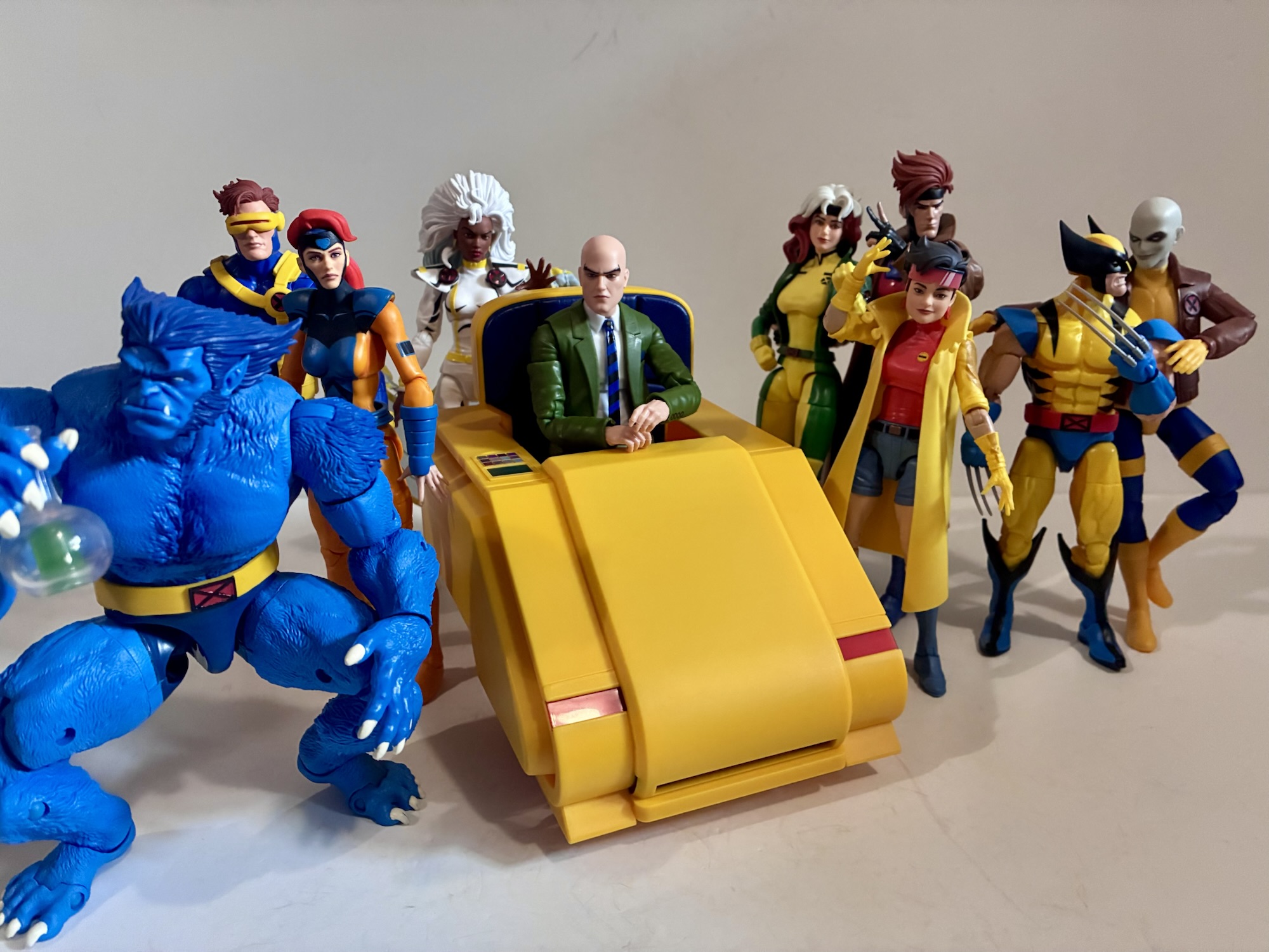
We’ll keep it to the original roster to prevent this from getting even more crowded.

For related figures, check these out:

Marvel Legends X-Men ’97 Archangel

On July 1st, 2026, our long wait ends. X-Men ’97 returns to Disney+ with its greatly anticipated second season a little over two years after the conclusion of the first. It’s something I have been looking forward to pretty much ever since credits rolled on the finale and the only thing that stinks about it…

Keep reading

Marvel Legends Professor X (Savage Land)

It feels like lately I’ve been getting swayed by clearance and discounts when it comes to my action figure purchases. Such is the case for today’s post on Professor X from the Marvel Legends line of action figures. Target had an exclusive version of Xavier featuring the character in his jumpsuit which showed up in…

Keep reading

Marvel Legends Professor X with Hoverchair

Most view superheroes as idealized versions of people. Superman has all the power he needs to mete out justice as he sees fit. He’s a man who is super fast, super strong, basically invulnerable, and he even has laser eyes for good measure. Not every character can be Superman though and as the stable of…

Keep reading

X-Men ’97 – Season Two Wrap-Up

It’s been two weeks since X-Men ’97 aired its season two finale, which in the entertainment world might as well be two years. As a culture, we move on from things real quick, but I’m still letting that second season simmer in my brain as I collect my thoughts on the season as a whole. The second season of X-Men ’97 was a success, but it was a different experience from season one. That season put the human and mutant conflict at its center. There were other subplots, but the season built to a major climax with the X-Men taking on Bastion and his army of sentinels. The second season centered its conflict on Apocalypse. The X-Men taking on a literal god is going to lead to a different kind of story. Over the decades, the X-Men have done all kinds of stories. Some are more grounded than others while plenty take the group to strange and fantastic destinations. There have been successes and failures with both approaches, but for me personally I do prefer when the X-Men keep mutant persecution at its core. As such, I was predestined to like the show’s second season less than the first, but there are other reasons why season one was the overall stronger of the two.

Season two picked up where season one left off with the X-Men scattered across time and the rise of Apocalypse (Ross Marquand) in focus. In true X-Men fashion, things moved quickly. Bishop (Isaac Robinson-Smith) and Forge (Gil Birmingham) had already deduced where each member of the team had ended up and already had a plan to bring them all home when the second season started. The future flung X-Men were returned to the present in short order and the past dwelling mutants made their way back home in episode four after a slightly elongated stay. During that fourth episode, Magneto (Matthew Waterson) was executed by Apocalypse and Xavier (Marquand) left a broken mess in the desert sand. I did a mid-season check-in which I’ll link to at the end of this post so I don’t want to spend too much time on the season’s first half, but it provided a good setup for the Apocalypse conflict. It introduced multiple plot lines including both the existence of X-Force and X-Factor and let us know that Apocalypse was not the sort of villain the X-Men could ever hope to reason with.

I did miss the sentinels this year.

The second half of the season (which was actually four episodes so less than half) was less focused. We received the one-off Wolverine (Cal Dodd) centric episode in the fifth spot where Logan was able to lead a team of friends and foes alike to check out a Weapon X facility only to come face-to-face with the Brood. It was all a ruse by Wolverine to get his adamantium back and his actions claimed the lives of two former comrades in Maverick and Kane. What followed was an episode centered on a newcomer, Polaris (Carolina Ravassa), and another that reintroduced the mutant-hating Graydon Creed (Ben Pronsky). The finale gave us the long anticipated resurrection of Gambit (A.J. LoCascio) and the eventual confrontation with Apocalypse which resulted in victory for the X-Men, but at great cost.

Rogue got a substantial power-up in the finale.

My initial thought is to blame the shift in focus from Apocalypse to more condensed stories as the cause for the season losing some of its momentum. The only problem with that theory is I consider the Wolverine episode the best of the season. In that, we got a good character study that also introduced some new conflict between Morph (JP Karliak) and Wolverine. It’s the sort of story that I think X-Men does best. Had the other episodes done something similar I think the season would have felt like a bigger success. Instead, the episode “Danger.exe,” while addressing the PTSD Xavier was feeling over the death of Magneto was a welcomed addition, the conflict felt very small. Danger (Rachel Kimsey) as a character was uninteresting. It sprung up out of no where and was dispatched of with relative ease. Polaris was also properly introduced in that episode and while I think the character is fine, it’s a bit tough to get the audience to care about a new character when so many of the existing ones are not being well serviced by the show. “Strange Land, Savage Heart” made some attempt to refocus the show on the Genosha fallout and the mutant/human conflict, but also felt almost inconsequential. It also brought Colossus (Robert Cait) back into the fold, though he was immediately sidelined following the conclusion of that one.

So…what did everyone think of Gambocalypse?

And the bulging cast was a problem. The original series had a large, but manageable, cast of characters. Even so, some would go several episodes with little to do or say. Most episodes would try to break the team off into smaller squads to better spotlight a few as opposed to trying to focus on many. X-Men ’97 doesn’t seem to care and is happy to shelve characters if it serves the story’s purpose. Beau DeMayo was the showrunner for season one and the writer and architect for much of season two. As a big X-Men fan, he understood what made the engine go. He also, as a fanboy, seemed to want to race through several moments and events from the comics and I feel that lead to tunnel vision, at times. Some episodes in both seasons felt superfluous in the moment, but they often did serve a purpose in advancing a longer running plot. We had to speed-run Inferno in season one to understand where Cable (Chris Potter) came from as it had importance later on. On the flipside, Wolverine had to get his adamantium ripped out in season one because DeMayo just thought it was cool. Season two, despite it being what I consider to be the season’s best, had to devote an episode to Wolverine getting his adamantium back because the show was uninterested in exploring a de-powered Logan. And I think some moments and actions had to happen in season two because DeMayo was building towards Onslaught, which was then aborted. The show didn’t need to add Polaris, but maybe she was going to play a role with Onslaught?

This still hurts.

With the cast becoming unwieldy, it was no surprise that some needed to be culled. And the chosen method for that seemed to be death. Magneto was taken out in the fourth episode. While Onslaught on the horizon was likely to be his way back to the land of the living, it’s now possible he’s gone for good. Or, at least, gone for longer than Gambit. Magik (Courtenay Taylor), who never got a chance to be a character, was killed off to further her brother’s plot which was a shame. Heading into the finale, it still felt like more needed to go. Since the original series ended, we have added Morph, Bishop, Nightcrawler, Sunspot, Forge, and Polaris to the X-Men while only subtracting Gambit. Colossus was sort of added, though he never made it into the title. X-Force brought back Psylocke (Naoko Mori) and Archangel (Christopher Barger) while X-Factor also returned, but really didn’t get any character development outside of Havok (Teddy Sears) and even that was only slightly. X-Men ’97 decided someone had to go (and really, more probably do) and that someone ended up being Nightcrawler.

Many may hate that it happened, but Nightcrawler’s death was handled pretty well.

Nightcrawler’s sacrifice in the finale was both shocking and heartbreaking. It was also beautiful and really a proper send-off for the character. I don’t think anyone wanted to say goodbye to the fuzzy, blue, elf, but it would have been harder to find a better way to do so. In the episode, Rogue (Lenore Zann) makes a bargain with the celestial Eson (Waterson): her life for the power to take down Apocalypse and save Gambit. After she departs with her new glow-up, Nightcrawler realizes what she has done and offers himself up in her place. It’s done well as the show didn’t telegraph Nightcrawler’s choice. And this is a show that isn’t exactly subtle about much. Having Rogue save the day and look at her hands in bewilderment that she’s still alive only for the camera to pan to show a sad looking Beast (George Buza) standing alone clutching Nightcrawler’s Bible to his chest was a true gut punch moment. Nightcrawler’s contented narration as he explains to the god why he is choosing to give his life for his sister is well written (Brian Ford Sullivan is the only credited writer on the episode) and well performed by Adrian Hough. The images we see of the X-Men back home living their lives could be interpreted as Nightcrawler’s hope for his comrades, but I choose to see it as what did happen. It’s such a good way to close the book on Nightcrawler that I hope it isn’t undone. When Gambit died in season one it felt like there was unfinished business so I didn’t hate the show bringing him back, but with Nightcrawler there’s a finality here. That and if the show keeps cheating death then it will cease to have meaning. It took a season and a half’s worth of episodes, but the show basically exchanged Nightcrawler for Gambit and that’s forgivable regardless of who the favored character is.

I’m not a religious person, but I didn’t take any issue with Rogue choosing to remember her brother in this way.

Where the show has never faltered is with the production end. The animation is a huge step up from the original series. Action scenes remain inventive and perhaps the greatest tragedy in Nightcrawler dying is we won’t get to see his skills on display again. He got a nice send-off in that respect first with his dual against Exodus (who I am a bitter was dispatched unceremoniously) and then when under the control of Apocalypse as he damn near took down the entirety of the X-Men and X-Force by himself. The soundtrack by The Newton Brothers also remains excellent and they know just when to turn to that bombastic main theme. They also do a great job of weaving in the old themes from the original series like using Gambit’s theme during his dinner scene with Rogue. And there’s nothing that gets me more excited these days than that opening kicking in before each episode. I hope there never comes a day when I experience that opening without getting goosebumps all up and down my body.

Apocalypse went out like a chump in the end, but at least it was at the hand’s of a fellow god.

Season two pinned its success on the confrontation between the X-Men and Apocalypse as well as the minor conflict of the X-Men vs X-Factor. Was that a wise decision? I think so, but the results weren’t quite there. Apocalypse was really sidelined following that fourth episode. The show tried to keep him on the viewer’s mind with little moments at the end of episodes six and seven, but it wasn’t really enough. He spent the bulk of the finale inside Gambit, and once he emerged, he looked ridiculous and was quickly dispatched by a powered-up Rogue. The show really could have used a tenth episode to let the conflict simmer. Actually have the mutants fight Apocalypse for more than a minute. The issue there, and it’s one that has always existed with Apocalypse, is that he’s just too damn powerful. There usually isn’t a believable way for the X-Men to go toe-to-toe with him, but that’s also a problem of the show’s making. I’ve always loved the concept of Apocalypse, but his stories often end unceremoniously. At least here there was a plausible end to the conflict, even if it felt like the Power Rangers summoning the Megazord and quickly dispatching of a previously insurmountable foe. Or a Dragon Ball Z power-up that reduces a previously unstoppable opponent to a punching bag.

A happy ending?

That was season two. Overall, I enjoyed my time with it and I’ll miss having an episode to look forward to each week (let’s not do the three-episode premiere again, please, it only hastens the end), but the season was not without its problems. For season three, it looks like we’ll be heading back to a human/mutant conflict and that bodes well for the future. It’s also the true end of the DeMayo era (had it continued, we would have been getting a form of the Age of Apocalypse) which gives the season an uncertain feel. One of his strengths as showrunner was his willingness to be uncompromising in calling out bigotry within the show’s universe. That’s something it will need with a President Creed, but in the hands of someone else will that be softened? The finale marked the return of Mystique (Randall Carpenter) and the only clip shown of season three so far featured her Brotherhood of Mutants tangling with some sentinels. Will Creed be a season-long conflict, or will this be something that gets taken care of as quickly as our time-displaced heroes this season? The road ahead is less certain and I am looking forward to it, but the lack of a major cliffhanger this year makes the wait a little more palatable. And as of right now that wait is only supposed to be a year so here’s hoping that come summer 2027 we’ll have more X-Men ’97 to talk about.

See you next year!

Previously…on X-Men ’97:

X-Men ’97 – “Survival of the Fittest”

We have reached the end of season two of X-Men ’97, albeit probably sooner than we would have liked given the nine episode order. Ten already seemed short compared with the 13 the original series used to get so nine is borderline cruel. All that said, before we dig into the review for the season…

Keep reading

X-Men ’97 – “The Dead Man’s Hand”

This was the episode of X-Men ’97 we all knew was coming eventually. I don’t think I need to provide a spoilers warning given the episode title before I say this is the return of Gambit. This was all setup in the closing moments of the first season when Apocalypse (Ross Marquand) found the queen…

Keep reading

INART Arkham Origins Batman

Best video game action figure ever?

I’ve had the INART Arkham Origins Batman figure for a little while now. I seem to never lack for material when it comes to this blog and it helps that I only make a post or two per week, but still, sitting on a review for over a month is unusual for me. And when it comes to this Batman action figure it’s not as if I’m not pleased with it. Far from it. It’s more that with INART the finished product is so good that I am almost at a loss for words. Even so, this is basically a review blog and I need to do my duty as an action figure enthusiast to talk about this Batman so let’s go!

INART, the 1:12 and 1:10 division of Queen Studios, has really exploded on the scene over the past year with some really incredible takes on characters from The Dark Knight Rises. I’m pretty sure I mentioned in the reviews of the figures I have, but I really didn’t have figures from the Christopher Nolan trilogy on my wish list any longer. I definitely didn’t have Catwoman on such a list. The figures from INART ended up being so good that I just couldn’t say “No.” And unlike a lot of products, action figures or otherwise, the in-hand experience with both was every bit as good as the promotional shots. When INART last year showed off its take on Batman from the video game Batman: Arkham Origins, it was pretty much the same thing all over again. The figure looked gorgeous and it was set to come with a ton of stuff. I have never played the game this suit is based on, but I did play the portable version Blackgate which features the same look, as far as I know. I even reviewed that game right here on this blog and I enjoyed it. The look for Batman in this game and the other Arkham games is not my favorite look for the caped crusader, but it is one I like. It works well with the INART aesthetic as, like the Christian Bale suit, there’s a lot going on. It’s armored, there are lots of panels, straps, and different textures that creates a challenge for anyone looking to reproduce it in plastic and I get a sense that the folks at INART like a challenge.

As good as this figure is, it’s not without some controversy. Originally billed as a 1:12 scale action figure, Batman comes in at around 7.375″ to the tips of his ears. Converting inches to feet for a 1:12 scale figure is pretty easy even for those not gifted at math and I think most can conclude that this is way too big for 1:12 scale. INART corrected the listing later and put him at 1:10 scale which is more reasonable. They went on to clarify that their movie scaled line will remain 1:12 while the video games (and maybe the comics?) will be 1:10. And that’s fine as I don’t personally care all that much if my video game Batman scales with my movie Batman. As long as it scales to other characters from the same source then I’m fine with it, though I do agree that collectors are justified in being irritated since the listing did originally refer to it as 1:12. INART wouldn’t be the only company to have issues with scale. Lots of them list their figures as 1:12 that aren’t even close and it is a pet peeve of mine.

They do such a good job with face sculpts and paint.

Batman arrived in the usual INART shipper with the actual product box within. Artwork from the game is used to decorate the box and it looks fine, but there’s no window or photography so in-box collectors might not get much out of it. At least I think they’re images from the game, but I suppose it could be product shots. Anyway, The figure is housed in a simple two-tiered tray within that’s well packed and includes detailed instructions. Seriously, I love these included instructions as they remove all ambiguity for what the intended purpose is for each and every little thing. In hand, Batman looks every bit as good as the promotional shots suggest. He’s basically all black of varying shades with some close to a gray like the chest. There are numerous textures in use simulating leather, Kevlar, and steel. There’s lots of subtle shading like black at the edges of the shoulder pads and each little rivet is hit with some silver. The gauntlets and greaves have a metallic finish, but it’s a dingy metallic like the suit has been well worn and the steel beat. The utility belt is more of a graphite and it’s adorned with square boxes and canisters that probably would provide some utility, but definitely wouldn’t house any of the more elaborate gadgets we see him utilize. The flesh of his head is a warm tone with some stubble painted on. The eyes are these barely perceptible slits in the cowl that look so realistic. I don’t know how they get their eyes to look so good. The cape is soft goods and it feels like a spandex type of material. It hangs nice and doesn’t seem to wrinkle much and overall is a nice, quality, material.

This is a very busy suit, but INART seems to have handled it well. The shoulder pads have these straps on them, but they don’t actually connect to the body so they don’t really interfere with anything. He has these big thigh guards, but those actually play into the action figure aesthetic since it works as a place to insert a thigh swivel. The crotch area is a bit odd as there’s the floating belt and then a floating piece underneath that. It almost looks like a back brace, but it’s basically a piece of soft plastic the abdomen sits in. Mine came out of the box a bit screwed up like it got twisted somewhere along the way. I didn’t even notice it for awhile, but once I did I had to look up promotional images to figure out how it was supposed to look. Since most of the figure is connected via ball pegs, it wasn’t difficult to pull it apart at the waist and reset it. And thankfully, it wasn’t misshapen as a result and it took on the proper form which is basically to hug the sides of the abs. It’s such a complicated design though that it didn’t surprise me that it took a bit for me to notice this little piece being out of place.

We may as well go right into the articulation since that plays into the construction of the figure. Like the other figures from INART, this thing articulates much better than it has any right to. The head is a simple double ball setup with a neck joint at the base and he looks up very well. The rest of the range is all there too and it’s such a perfect example of how to do this joint properly (admittedly, it helps that he doesn’t have any hair to get in the way). There are joints at the shoulders, biceps, elbows, wrists, diaphragm, waist, hips, thighs, knees, ankles, and toes. The shoulder ball peg does provide some butterfly type motion going back and forward, but the chest armor prevents much range in that direction. It’s one of the few weak spots as the rest is pretty damn good. The double elbows will bend past 90 degrees as do the knees. There’s a slight boot swivel that provides for some adjustment posing and the covers over the boots are soft and don’t really interfere with the ankle articulation. The hips do drop down and it’s a pretty sturdy joint. Even without using it, Batman can kick forward 90 degrees and can almost do splits out to the sides if you can get the thigh armor to slip under the hip. The diaphragm at first appears very limited, but give it a firm push and it will move forward quite a bit. Combine that with the ball waist and Batman can crunch more than this suit probably would allow if it were real. And every where the figure moves the sculpt is continued throughout so there’s really no gaps or smooth spots. There are a few spots, like the shoulders, where if you push it too much you may pop the joint out of place, but nothing that’s painful to reassemble. I do worry that using that diaphragm joint too much to crunch him forward might start to scuff the abdomen, but otherwise there really aren’t any complaints here. The cape is also wired, though only on the outside and not all throughout. It will offer some posing, though nothing incredible.

Batman comes with a lot of stuff. For alternate portraits we get one which has a teeth gritting, aggressive, expression that looks just as good as the neutral default one. For hands, we get ten and the instructions list them as such: fists, Batarang hands, Cryptographic Sequencer Holding left and right, Gun holding left and right, right hand with smoke pellet, right hand explosive gel holding hand. They’re not all symmetrical as the Cryptograph Sequencer hands are like a grip and a pointing hand. The Batarang hands are basically fists with little slits in them to slot in the included Batarang, which looks nice as it’s all black with a silver edge. The smoke pellet is a bit of a deceiving name as it’s more like a soft ball and Batman palms it to throw. It’s permanently affixed to the hand. The gun holding hands are also not symmetrical as the right hand is a trigger hand and the left is closer to a more natural gripping hand for supporting the barrel.

As you would likely expect, all of the gadgets listed amongs the hands are also included. The Cryptograph Sequencer is basically a handle with a screen at a right angle. This is used in the game for infiltration puzzles and it looks fine, but the screen is just sprayed with silver paint making it look like there was a sticker there that got ripped off. The explosive gel applicator is basically like a gun handle with no barrel. It looks fine, but could have used a gel effect. The Disruptor is also included which is more of a traditional looking gun. Batman holds a rear handle and a front grip and it reminds me of the explosive gel gun from The Dark Knight. It’s a little awkward for Batman to hold as the rear handle is very thick, but it’s doable. The Batclaw is also included which is basically his grapple gun in the game. It too is really thick and a bit awkward looking in Batman’s hand. That’s not a fault of INART, but the design from the game. It’s certainly not as tidy as the same from the animated series. Included with it is a claw part which looks nice, but doesn’t articulate which is a bit of a bummer. There are two pieces of metal “cable” for it, one that is short and one that is long. The short one basically makes it appear to be locked and loaded while the long one can be used for firing poses, though the inability to have the claw open hurts the illusion a bit. Also included is a stand with a rather large, round, base of clear plastic with sculpted circles radiating from the middle like a bull’s eye. There’s an articulated arm to plug into it and it’s pretty sturdy though you may have to tighten the screws initially. Lastly, there’s also a branded INART plastic bag if you want to store all of the parts within it, though I tend to just keep everything in the tray.

Gotham needs me.

The load out is impressive and there’s not much of anything that’s missing. I would have liked an open claw for the Batclaw and I’m guessing some would like a Bruce Wayne portrait, though I’m fine without. The box refers to this figure as the standard version and as of right now there is no other version available or planned, from what I hear. If there were a deluxe version I’m not sure what else would be included apart from the few things I mentioned. The bottom line is this figure looks incredible and it poses very well. I don’t love the design of some of the accessories, but there’s enough here that there’s no shortage of display options. I’ve been messing with this guy often and changing him up on my desk frequently sometimes bringing in the stand, sometimes not. Similar to the Bale Batman, I find he does look pretty damn awesome in vanilla poses which is a testament to how good the sculpt and paint are. He looks great in a crouch, throwing punches, or firing off cables. I don’t even need another character from the game to pair him with as he’s just fine being a one-off for me. Getting him, of course, is a bit tricky if you live in the United States. INART doesn’t have a license to distribute here so the figure has to be imported. He should run somewhere in the $70 range, but at this point a lot of retailers that have stock have probably raised the price. And shipping isn’t going to be cheap so expect to pay close to $100. With where prices are these days within the hobby, that doesn’t seem as outrageous a price as it once were. I don’t know if any figure at this scale is truly worth a hundred bucks, but I don’t think anyone is going to be upset once they get this guy in hand. It’s probably the best Batman figure I’ve had the pleasure of placing my hands on and I can’t wait to see what this company does next.

For more INART figures reviews and a look at the source for this Batman, check these out:

INART The Dark Knight Rises Catwoman

Queen Studios is back with another installment of its INART The Dark Knight Rises action figures and this time we’re talking about Catwoman. Portrayed on the screen by actress Anne Hathaway, Catwoman was something of an anti-hero in the film. In a post Occupy Wall Street world, her anger and frustration with the ruling class…

Keep reading

INART The Dark Knight Rises Batman – Deluxe Version

Is this a review I really need to do? Probably not, but I’m doing it anyway. Queen Studios wasn’t a shop that was on my radar going into 2025. I’m guessing that’s true for a lot of folks and that’s probably why they had a media blitz when it came time to promote their brand…

Keep reading

Batman: Arkham Origins Blackgate

When Batman: Arkham Asylum was released in 2009 it ushered in a new era for the caped crusader where video games were concerned. Prior to that, Batman had not had a good video game in a long, long, time. Depending on your opinion of his efforts, you may have gone all the way back to…

Keep reading


NECA TMNT Toon Neighborhood Dudes Incognito Mikey

Pizza and video tapes – looks like a good time.

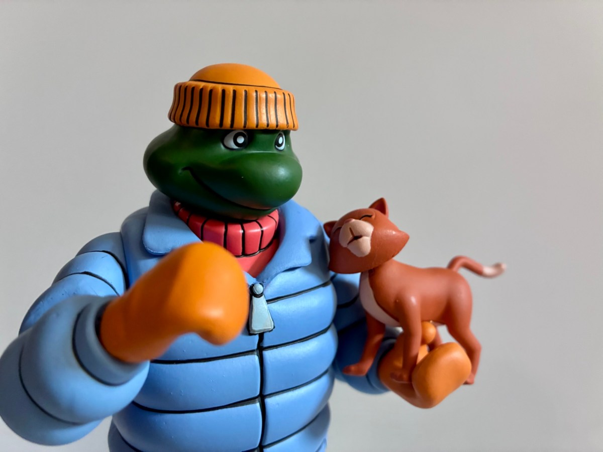
As I sit here and look upon the latest Teenage Mutant Ninja Turtle action figure from NECA I can’t help but wonder if this is the last? Not the last figure from the line for me, but the last actual turtle. NECA has, like everyone not named Mattel, lost the license which allows them to produce 1:12 and 1:10 scale action figures of the Teenage Mutant Ninja Turtles. It runs out at the end of the year or shortly there after and NECA is on record as saying what they’ve shown is all that’s left. And when it comes to turtles based on the 1987 animated series, NECA has four releases on tap for us dedicated to each turtle. Dubbed the Neighborhood Dudes subline, each turtle is in some sort of disguise or unique look with Donatello as a construction worker, Leonardo as a butler, and Raphael in a sailor suit. Those three I’m not really that interested in, maybe I’ll cave on one eventually, but not all three. The only one I wanted was Michelangelo who is featured in his puffy coat look. Not only is it the most memorable disguise apart from the fedora and trench coat look for me, I also associate it with winter and the Michelangelo one-shot comic which takes place at Christmas. And if you know me then you know I like Christmas.

This line has had no shortage of Mikeys.

Incognito Mikey comes in a new box styled after the spotlight VHS tapes of the past. The artwork is by Aaron Hazouri and the packaging is credited to Travis Hastbeck with interior photography by Matt Kloberdanz. The sculpt is credited to Tomasz Rozejowski and Kushwara Studios with paint by the usual duo of Geoff Trapp and Mike Puzzo. Mikey doesn’t appear to share many parts with previously released turtles. The arms, legs, feet, and mittened hands are all new with the smiling, alternate, portrait perhaps a retooled head from the Punk Turtles set. The default head with scowl and phoney nose is all new from what I can tell. Some parts will likely show up in other figures in this wave, but basically what is here should feel new. Not that it feels much different from other NECA turtles as Mikey is pretty much as expected. The main portion of the coat is an overlay and the sweater underneath is part of the same overlay. He has that rounded, turtle anatomy and stands at about 5.875″ to the top of the head putting him right in line with the turtles who came before him.

Where are you off to, Michelangelo? You look like you’ve got something to hide.

The design of this one is fairly simple, but the sculpt and paint are executed to near perfection. The coat is a pale blue with black linework to accentuate that puffy look. The interior sweater is orange with more linework and the paint is mostly clean. There is a blob of blue on the back of the collar, but at least it’s on the back and not the front. The mittens and hat are a pale orange and I like the contrast with the rest of the body while the slacks are a soft blue-gray with brown loafers. There will be the usual paint flaking at the joints because this figure is painted all over. The back of the knees are where it’s likely to show the most, but the plastic beneath matches the paint well so it’s not really an issue. I did have the right knee cap pop off of mine when I first articulated it as it looks like the factory missed it with the glue or applied too little. It pops on easy enough, but it was interesting to see and helps explain how NECA is able to get its knees to color-match to the rest of the leg, something other companies struggle with because they don’t produce a separate knee cap in PVC. The cut-out for the knee does stand out a bit almost looking like a knee pad, but it doesn’t bother me. I can see the argument though for a single-hinge here since it would hide articulation a bit better and probably not sacrifice much when it comes to movement. That’s the approach NECA took with the elbows. As for the heads, I do very much like the alternate, smiling, portrait that foregoes the ear muffs and goofy glasses of the default portrait. That one has more of a scowl and while it looks good, I prefer the happy approach with this one.

It’s fair to question if these gripping hands are different enough to justify existing. Maybe fists would have been better?

Articulation is what you would expect and I already touched on it a bit. We get a double ball head, shoulders, single elbows, wrist swivel and hinge, waist twist, ball-socket hips, thigh pivot, double-jointed knees, and ankles that hinge and rock. The knees are pinless and the single hinge elbows allow for a swivel at the joint. As is often the case with a NECA turtle, there is likely a diaphragm joint of some kind, but it’s basically inaccessible due to the turtle anatomy. Since the jacket covers the waist, the twist there is more usable than it is on a turtle with a visible shell so that’s a plus. There is a crotch overlay which severely restricts articulation at the hips. This is not a turtle for doing splits or sitting down. It’s not a turtle for doing much really, but if you’ve been collecting this line for awhile then you probably expected as much.

It’s also a Donatello!

For accessories, Mikey has the aforementioned two heads as well as two sets of hands: tight gripping and loose gripping. There’s the customary pizza and yet another grocery bag accessory. This one comes loaded with a bunch of VHS tapes. Those are Mikey’s accessories, the other accessories belong to Donatello. NECA apparently has designs on fans buying multiples because Mikey comes with another set of heads and hands which are color-coded to match Donatello. That means all of the orange parts have been replaced with purple. Considering all of the turtles wore this disguise in the show, it makes sense to offer the others in some fashion to not only build out the collection, but for NECA to make more money. I’m guessing retailers may have soured a bit on the four-packs of the past and doing these solo releases was a more economically viable path forward. The only problem is that in the show it wasn’t just the hats and mittens that changed color between each turtle, but the sweater underneath as well. Donatello wore a light blue sweater, Leonardo yellow, and Raphael purple. Now, one could buy four of these and paint the sweaters if they wanted to achieve something close to screen accuracy. I’m not sure how easy that would. One could pop the arms off with some heat and slip the jacket off, and then once done, it probably wouldn’t be that hard to cut the sweater off to make it easier to paint. Or one could simply paint it as-is, but that’s obviously a lot trickier. The real hardest part would be painting around the glasses of the disguise portrait, but maybe most don’t care about that part? I can’t see myself going through the trouble unless this release gets heavily discounted, but for those that want to, at least you’re halfway there with the heads for two turtles already painted. Of course, you’ll end up with a bunch of extra heads if you buy four of these.

I mentioned it earlier, but one of the draws of this figure for me was its resemblance to Michelangelo in the Mirage Studios Michelangelo one-shot. In that comic, Mikey sports a look pretty similar to this one as he seeks to break up a crime ring focused on stealing Christmas toys. It’s also the issue where he befriends a little, stray, kitten. The episode of the 2003 cartoon, “The Christmas Aliens,” is based on the same issue. I wish NECA had included a kitten that Michelangelo could hold easily. We have the cat which came with the Channel 6 set, but it’s in a standing position and a little awkward, but it will have to do. It helps give this figure a second life though as a Christmas decoration, and you know I’m all about that.

I think this is going to be how I display him.

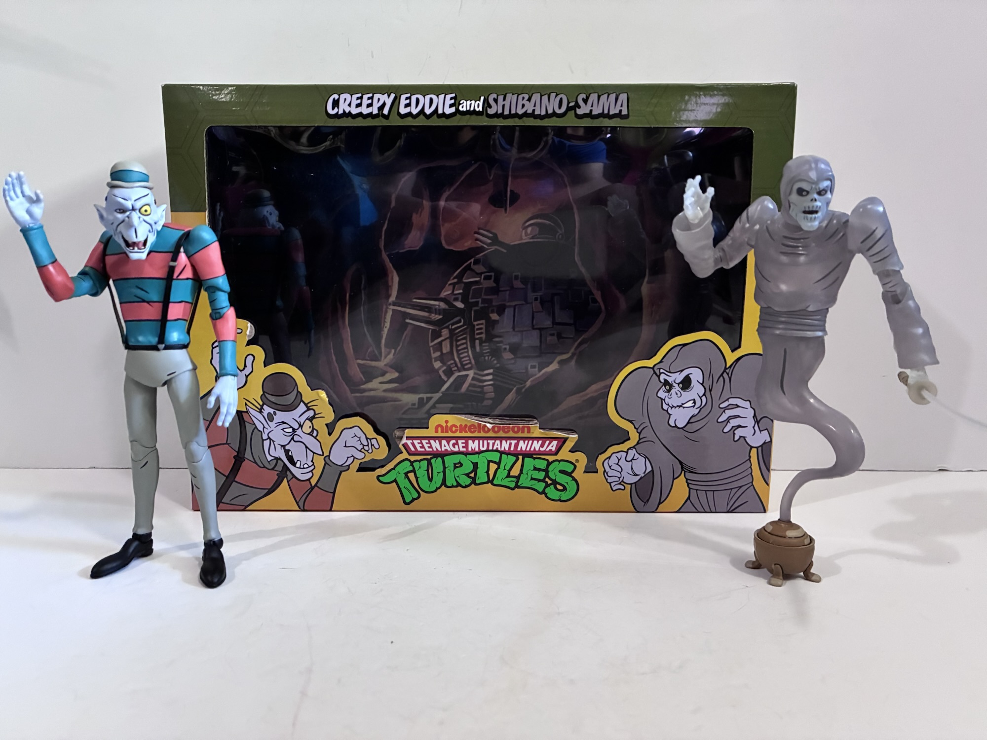
Is that it? The end of turtles from NECA for me? Quite possibly. It’s not exactly a high point for the company to go out on, but it’s also not a low point or anything. It’s an alternate look for Michelangelo from the cartoon which makes it somewhat of a deep cut, but that’s part of NECA’s legacy with TMNT. They did hit on a lot of those deep cuts no one ever tried to do. In this line we had all manner of Bebop and Rocksteady, their gang of forgotten mutants, Lotus Blossom, the toon versions of Tokka and Rahzar, Chakahachi, Zach, Dirk Savage, and so many more. We even got characters I passed on because I had just never thought to myself that I need someone like Creepy Eddie in my collection, but I appreciate that I could have him. This is one of those action figure lines that’s going to be held in high regard for years to come. Those who missed out will lament doing so and some figures will probably command stupid prices on the after market for those with a wicked case of FOMO. As for me, I’m not quite done with NECA’s Teenage Mutant Ninja Turtles quite yet as I have another review to write and at least one more figure on the way. Will there be more? Who can say? For now, I’m feeling pretty content.

For more NECA TMNT and thoughts on the license changing hands, check these out:

NECA TMNT Toon Robo Tokka and Robo Rahzar

The vintage Playmates toy line for Teenage Mutant Ninja Turtles had no shortage of variants. There were beach turtles, police turtles, hockey turtles, and so on. We even had something akin to Operation: Desert Storm turtles. In looking back, it seems like few stones were left unturned unless you want to get into the weeds…

Keep reading
The TMNT Collector Landscape is About to Change

Last week brought with it the annual event with massive reverberations throughout the collecting community known as San Diego Comic Con. The once humble convention held in a hotel basement to celebrate comic books has become a pop culture bonanza. Comics still play a pretty central role thanks to their proliferation outside the venerable medium,…

Keep reading
X-Men ’97 – “Survival of the Fittest”

Original premiere date August 12, 2026

We have reached the end of season two of X-Men ’97, albeit probably sooner than we would have liked given the nine episode order. Ten already seemed short compared with the 13 the original series used to get so nine is borderline cruel. All that said, before we dig into the review for the season finale I do just want to say how happy this show has made me. It still blows my mind that I’m watching a continuation of something I loved as a child. When that theme song starts up, I get goosebumps all up and down my arms and the feeling that comes over me is something akin to a high. It’s fantastic, and I hate that it’s all over so quickly.

“Survival of the Fittest” is the culmination of the season long arc involving Apocalypse (Ross Marquand). Even though the big guy was somewhat put on ice after the fourth episode, he’s back and ready to go for the finale and caught in the crossfire is Gambit. Last week, Gambit (A.J. LoCascio) made his long telegraphed re-debut as he rose from the grave with an all new look, but an all new mind set as well. Gambit quickly set out to putting together a crew and he turned to his roots for that as he returned to Louisiana to corrupt the assassins and the thieves. Gambit choosing to return home should have been a tell for all who love him because Gambit vowed to never return there and by episode’s end we found out he wasn’t the one calling the shots: Apocalypse was. X-Force had found the withered husk of the mighty Apocalypse in the previous episode and the conclusion everyone seemed to draw was that Gambit had been resurrected as his horseman of Death and he made his maker his first victim. Oh, how foolish for Apocalypse cannot be killed so easily, and especially not by one of his own making. He likely needed a new host body and Gambit was his chosen vessel, but before he could resume his crusade against all he deems weak he needed to visit someone from his past: Candra.

The X-Men have a whole bunch of foes to deal with, but the big one is still Apocalypse.

Candra (Debra Wilson) is who we were introduced to during the second season of the original series as the X-Ternal. She is the apparent deity the thieves and assassins aim to please in exchange for their supernatural powers. We saw Candra make an appearance in the past as part of Rama-Tut’s court, but at the time it wasn’t clear why? It turns out, she and Apocalypse would meet sometime after the events in Egypt and the big guy apparently took a liking to her so much so that he bestowed upon her some of his awesome power. She took it and ran and Apocalypse has been trying to reclaim it ever since. Now, it makes sense why he’d have interest in Gambit. If he knows about Gambit’s connection to her via the thieves (and why would he?) then posing as Gambit could bring her out of wherever it is she goes when she isn’t in that swamp and allow him to reclaim what he once gave up. And that’s exactly what happened and the only challenge Apocalypse faced came from a likely expected source in the X-Men. In particular, Xavier (Marquand) and Rogue (Lenore Zann). Xavier chose to battle Apocalypse in Gambit’s mind in what was nearly a 1:1 recreation of a similar battle for the soul of Jean during The Dark Phoenix Saga. Only this time, Xavier failed and it was Rogue who somehow was able to enter Gambit’s mind and make the save. I say “some how” because she and Gambit have never demonstrated a psychic rapport before, but he also handed over the power he took back from Candra to her. Perhaps that’s doing the heavy lifting here?

Val Cooper’s villain turn has been pretty gradual this season.

Speaking of, why did Apocalypse do that? Does this all go back to that conversation he and Rogue shared in the past regarding love? That’s one of the questions I had going into “Survival of the Fittest” where the X-Men need to free their friend from Apocalypse’s control, but also contend with recently allied X-Factor and the remnants of X-Force. Jubilee (Holly Chou) and Sunspot (Gui Agustini) defected from Cable’s (Chris Potter) team when it became obvious that Cable’s only objective is destroying Apocalypse even if that means killing Gambit in the process. X-Factor has it out for Charles and his X-Men and their choice to get involved on US soil has put them in the crosshairs. Will the supposed good mutants all figure out they have a problem bigger than each other or will everything just fall apart and play into the hands of Apocalypse?

If the X-Men are going to save Remy, then you know Rogue is going to have to play a big part.

For the finale, Storm (Alison Sealy-Smith) is given the honor of stating the “Previously,” line, though if you think that’s a tip for how the episode will go I will say it most certainly is not. Jubilee and Sunspot are back in the roll call this week, though Colossus still remains on the sidelines. Perhaps he’ll be a season three addition? The ending clash has also been changed to feature Xavier’s X-Men on one side and Val Cooper’s (Catherine Disher) X-Factor on the other. The X-Men remained in their Jim Lee era costumes for this clash all season and I wonder if that will be changed next year? Or maybe leaving them in those looks will always be a way to celebrate the original series? I wouldn’t mind a return to those looks, personally. I’ve never been a fan of the black and yellow which, like the original movie suits, seemed to be born out of the idea that the old, colorful, costumes were something to be embarrassed by.

X-Factor being accompanied by Sentinels is a perversion of what they should be standing for.

The episode wastes no time in getting to the conflict. X-Factor, along with Cable, Archangel (Christopher Barger), and Psylocke (Naoko Mori), are knocking on Xavier’s door while Gambit remains unconscious. He’s a ticking time bomb though and about the only answers anyone can come up with rests miles below the water’s surface. There, Beast (George Buza), Rogue, and Nightcrawler (Adrian Hough) have come upon the celestial ship of Apocalypse, last seen in the past as a temple, but last seen in this era back in the episode “Obsession” from the original series. Beast still has a small fragment of the ship’s A.I. and it’s enough to revive it and reactivate the portal to the celestial realm we saw En Sabah Nur enter and emerge from as Apocalypse in “Rise of Apocalypse.” The ship warns the group that entering such a place requires a price, but Rogue is determined to do whatever it takes to save Gambit while Beast and Nightcrawler can do little but watch.

On Genosha, we get to watch as Cooper’s forces storm the X-Corp building in a bid to get Cable close enough to take out Gambit. They are convinced that destroying Gambit is the only way to eliminate Apocalypse and it’s only a matter of time until he takes over Gambit’s mind and body, as he’s done to so many before. There is some good action spots including Jubilee and Havok (Teddy Sears) battling it out in airplanes, Wolverine (Cal Dodd) and Morph (JP Karliak) taking on the duo of Archangel and Psylocke, and a big showdown between parents and son. There’s a lot to pack into 30 minutes (it would have been nice to get an extended ninth episode given they axed the tenth), but the pace felt solid. The action was satisfying and the character moments were also present. I might have preferred to have more character moments to go out on, but I also can’t critique the ending. Without spoiling anything, it was beautiful.

There were some fun pairings in this one, like this confrontation between Psylocke and Wolverine that doesn’t go how Betsy imagined it would.

I went into this episode unsure if X-Men ’97 could stick the landing. The whole season had been building towards this confrontation, but along the way it reminded me that the big spectacles aren’t really the draw with X-Men. It’s the team dynamics, the inter-character conflicts, the soap opera elements that make the show unique among a litany of other options these days. It’s similar to how the draw with Spider-Man is less about Spider-Man and more about Peter Parker which was really on display in Brand New Day which appears on its way to be the most successful film at the box office ever in terms of number of dollars spent. Hopefully there is a lesson in there for Marvel. X-Men ’97 found a way to stick that landing and found it in an unexpected source. Should I have seen it coming? Perhaps, but I was content to just sit back and let the show take me on a ride this week and I never really found myself trying to forecast the end. I was concerned at the onset it would feel too much like the Dark Phoenix Saga because it certainly did the prior week. In a way, it did borrow elements from that this week, but with a different resolution. There was also the elephant in the room that is Apocalypse. I like Apocalypse as a villain, but my problem with him going back to the original series is that they never found satisfying ways to stop him. He would just sort of leave and the one time they really stopped him was at the end of “Beyond Good and Evil” when it was kind of a goofy, unsatisfying ending. One thing they absolutely get right with this finale is that it’s only sort of about Apocalypse, but it never loses sight of the fact that it’s primarily about Rogue and Gambit and the family they’ve acquired who will risk it all to help them. Even when it means, in the case of Cyclops (Ray Chase) and Jean (Jennifer Hale), taking on their actual family.

Cable arrived on Genosha amid literal fireworks and now he returns amid a hail of gun fire.

Like the end of season one, there is a post credits scene setting up season three so do make sure you stick around for that (or use the skip credits option). I’ll likely make a season two wrap-up post to get more into spoilers, but suffice to say I like what they’re setting up for season three. I just hope we don’t have to wait longer than a year this time (they showed a clip at San Diego Comic Con and could conceivably show another this weekend at D23 so that’s a positive sign) as that can really derail momentum. X-Men ’97 is one of the best things Disney and Marvel have going right now so I hope they don’t do anything to stifle that. This finale was terrific. If you felt the season was losing some of its momentum coming into the last episode then rest assured, this one is the payoff you likely hoped for. I do think it will be controversial and it will have some major lasting impacts on the show, but in the moment I found it satisfying even if a bit painful. Sometimes, that’s a mark of good art.

Previously…on X-Men ’97:

X-Men ’97 – “The Dead Man’s Hand”

This was the episode of X-Men ’97 we all knew was coming eventually. I don’t think I need to provide a spoilers warning given the episode title before I say this is the return of Gambit. This was all setup in the closing moments of the first season when Apocalypse (Ross Marquand) found the queen…

X-Men ’97 – “Strange Land, Savage Heart”

If you were hoping for a quick follow-up on the closing moments of last week’s episode featuring Apocalypse and a certain resurrected cajun, I’m afraid I have some bad news. The show is going to slow walk that plot as this week we’re dealing with more Genosha fallout. Considering the magnitude of the event, I’m…

X-Men ’97 – “Danger.exe”

After last week’s side trip up north to get Wolverine his skeleton back, this week’s episode of X-Men ’97 brings us back to the mansion which we really haven’t seen much of so far this season. The season’s sixth episode is centered on survivor’s guilt and the sins of a parent. For the guilt portion,…


S.H.Figuarts Dragon Ball Z Super Saiyan Son Goku – Fighter of Rage

He’s a ragin’ saiya-jin.

When you’ve been making figures of a specific property for a long time, there comes a point where there just isn’t much left to turn into plastic. That’s why companies like Bandai, and they have been with Dragon Ball for a very long time, end up resorting to playing the hits with incremental upgrades. And it’s magnified with a property like Dragon Ball Z which stopped producing episodes and manga 30 years ago. When Bandai brought in Tamashii Nations now more than 10 years ago to liven up the DBZ brand, it made a lot of the main cast, but those designs grew long in the tooth. That’s what lead to the 2.0 body for several characters, but even that’s old now so we’re onto 3.0. The 3.0 Goku body debuted last year and the response has been a little tepid. It’s clearly superior to the old one in some obvious ways, but perhaps inferior in others. My experience with that figure, Let the Games Begin Super Saiyan Goku, also were plagued with some minor quality control issues. The kind that are more annoying than deal-breaking (well, the alternate hair piece is basically unusable), but still not up to par with the majority of releases in the line. It gave me pause on future figures on that body and I did end up cancelling a preorder I had for Super Saiyan Blue Goku. One I could not entertain canceling was Super Saiyan Son Goku – Fighter of Rage. That’s because this one was through Premium Bandai, the pay-up-front storefront that doesn’t allow cancellations. Here’s hoping I didn’t get burned again because this one is nearly double the price.

Left to right: Games Begin Goku (3.0 body), Fighter of Rage, and Lowest Born Saiyan (2.0 body)

This version of Super Saiyan Goku is essentially a redo of the Awakening Super Saiyan Goku Bandai released years ago. It depicts Goku right after his initial transformation into a Super Saiyan during his fight with Frieza. His gi is in tatters, the blue undershirt is all that’s left from the upper body portion, and his flesh is marked with battle damage. He’s ripped, but not nearly as bulky as he’ll get during the later stages of the fight which is captured in the Legendary Super Saiyan Goku figure from a couple of years ago. In other words, this is a pretty hyper specific look for Goku and the only reason to get it is if you think that older figure needs an upgrade or you never got it. I never got that one. It was reissued a couple of years ago as a Tamashii Nations pop-up event exclusive and I was surprised it never made it to the website. Had it, I probably would have bought it as it still looked pretty good and I think Bandai upgraded the face-printing on it like it has for other reissues. I think it had translucent hair which I don’t love, but it’s also not a dealbreaker for me. With this one going up, I no longer need that one and my primary motivation for ordering it was just that I didn’t have the old one. It’s a cool look and an iconic moment from both the show and manga. It did cost $65 and Bandai made it more enticing with a free shipping promotion, but $65 for a good figure these days is becoming the norm. And by Premium Bandai standards, it’s on the cheaper side. When it arrived it looked good in the standard window box packaging, but on the lower left corner of the box read a warning: Made in Vietnam.

During COVID, Bandai seemed to shift a lot of their manufacturing from China to Vietnam. I think it started before that because as time goes on labor gets more expensive in China where factory jobs probably aren’t as enticing as they used to be for the general population. Plus, they’re good at it and can charge more. Vietnam is the upstart in this scenario and is thus attractive to companies like Bandai because they do have lower prices. They also have less experience with action figures as intricate as what Bandai puts out. Some releases, like Cooler, have come out of the Vietnam factories and have been stellar. Others, like Trunks, not so much. That 3.0 Goku was out of Vietnam and it felt like a real step back for the factory there. With this figure using some of the same parts, I assume it’s out of the same building. Does the Premium Bandai distinction mean it gets a little more TLC? Maybe. Hopefully. Thankfully, my fears in this instance are largely unfounded. This figure is what I expect of not just a Premium Bandai release (and let’s face it, the “premium” tag isn’t implying better quality), but a Tamashii Nations figure in general. The parts fit as intended, there’s no weird, chewed, up edges on the plastic, and the paint is where it’s supposed to be.

Goku stands at approximately 5.25″ to where his face ends. Factoring in the hair, and we’re up to 6.625″ to the tip. He’s pretty much eye-to-eye with the Games Begin Goku. The look and finish is much more premium. That Goku is $35-$40 and looks like a cheaper toy. This one has more elaborate shading on the pants to mimic that Super Saiyan aura. The material also has a softer feel in-hand possibly because the material needed to be thicker to accommodate the additional sculpting. There’s less shine as a result from the plastic even though when it comes to paint there really isn’t a ton here. In terms of parts sharing there’s basically none. I would guess the innards share some parts, but the visible portions of the sculpt are all different. Mind you, they’re the same base mold, but everything here has sculpted battle damage. Even the hands. I’m not sure if that saves them any money, though they’ll likely find other uses for these tools down the road. The shirt is an overlay that’s been glued down and the body beneath has sculpted damage as does the shirt. One of my few complaints is that the top of the shirt was not glued down and it sticks up like a tank top. That may be purposeful to accommodate the articulation, but it is a bit annoying. The belt is a floating piece and the pants are the most elaborate part of the sculpt. There’s lots of little strands of material sticking off and torn parts where flesh is exposed underneath. They also fixed the look of the hips to some degree making that cut-out for the thigh swivel less obvious. I still feel they’re overthinking this part of the sculpt and articulation, but at least it’s better than before.

The alternate hair seems to work best for charging poses, though I think his hair was drawn this way while in flight.

The bigger price point is essentially all tied into the sculpt because Goku doesn’t come with a ton of stuff. He has five portraits he can utilize: neutral, teeth gritting, yelling, a smirk, and an alternate teeth gritting expression where he’s looking down and the shape of his mouth is different from the other one. He also has two hair pieces one of which I’d call neutral and the other is a powering up option. The powering up one is harder to get onto the neck peg, especially because this utilizes that double peg with the hinge in the middle that likes to flop around, but it’s not impossible to get on. The faces fit snug and are less prone to leaving gaps when compared with The Games Begin Goku. Some take more effort than others, but it’s definitely an improvement. They do take more elbow grease with the alternate hair, but I was able to get all fairly snug with some effort. For hands, Goku has fists, his martial arts posed hands, a more relaxed take on the style posed hands, Kamehameha hands, and open hands. There is no effect part included which is a bummer and something that really should be customary with these Premium Bandai offerings. There’s also no flight stand and no extra parts for another figure (something they love doing with their store exclusives) so pretty light by the company’s standards. We’re over due for a new Kamehameha blast effect, though I’m almost relieved that he does not come with yet another charging effect.

The articulation is basically the same as The Games Begin Goku. There’s less stuff on the torso so the arms are a bit easier to work with. He has that goofy neck joint, but it doesn’t really let him look up much. Down is fine, and don’t be surprised if the faces work their way off slightly when positioning the head around. Especially with the alternate hair. The arms can get into various charging poses and I like that the battle damage is continued throughout the articulation such as in the butterfly joint caps and in the knee bends. The knee is that single hinge, but it goes beyond 90 degrees. The right knee is a little funky because it’s exposed due to the torn fabric. When you bend it all the way it will leave a gap below the exposed knee cap, but that knee cape is on a hinge itself and can be adjusted to your liking eliminating the gap entirely. The forward and back ab crunch is also a little better and less gappy than before. We also still have that odd pivot point above the boot. I found with the previous Goku it was a touch loose and made standing him more of a chore than it should be, but here it’s not as loose. I still question it’s usefulness. Everything is pretty smooth, but there are places where the figure will pop apart if you push things too far or if it gets hung up on something. Since it’s basically all ball joints, there’s no real risk of breakage, just be mindful if you pop the arm off by mistake that inner pieces may go flying. I do find the shoulder can get hung up at times on the cap pieces meant to close gaps. It might even be a good idea if you run into the same to just pop the arm off and adjust it (or not, I did this and the arm disconnected at the cup-hinge inside the torso and was a pain to get back in, but it did fix the floating piece so your mileage may vary). The cap on my figure’s left shoulder was really jammed in there and wasn’t hiding things as well as the right shoulder. I also popped the figure apart at the waist by mistake and the blue piece covering the abs flew out. I couldn’t tell which was supposed to be the front and back, but thankfully there’s a promo image where it’s very exposed so I was able to figure that out. If you find yourself in a similar situation, the front has a crease that goes all the way across while the back has two creases towards the sides.

The pose most Goku figures are judged on.

This is ultimately a better figure than the previously released The Games Begin Goku. It has a more premium look and feel and everything seems to work as intended. The articulation is good, not the best I’ve ever seen, but a wide variety of Goku poses are available. At $65, it’s an okay value, but since it was a limited Premium Bandai run that means virtually no one will pay $65 from here on out to acquire this one. Had I missed out, I may have been willing to extend myself a little further to add it to my collection, but with how often Bandai re-releases exclusives as variants I’d probably wait. They just announced a new full power Frieza that’s a re-release of the previous exclusive only now they actually painted the battle damage which is arguably better (no, I’m not rebuying it just for that). I don’t know why they don’t paint the battle damage to begin with and it really should have been painted here. Just fill in those sculpted-in lines with black and it would better match the source. There should be a little blood too. The accessories are a tad light, but not egregiously so. I would have loved an energy part, or a portrait of him actually transforming with the whited-out eyes. As is, it’s a good release and I feel much better about it than I did the last SHF Goku I purchased. I have a few more on preorder bought and paid for so hopefully they turn out just as well.

If you like Goku, I have no shortage of Goku figure reviews:

S.H.Figuarts Dragon Ball Z Super Saiyan Goku – The Games Begin

It was around 8 years ago that Bandai released an update to their Goku body. Dubbed the 2.0 mold, the company has since created many action figures of the legendary hero since then. There’s nothing inherently wrong with the sculpt, but some aspects of it have become dated. When Bandai wanted to do an update…

Keep reading
S.H.Figuarts Dragon Ball Daima Super Saiyan 4 Son Goku (Mini)

It’s no great secret that the black sheep of the Dragon Ball universe is the anime Dragon Ball GT. Created in-house by Toei animation, Dragon Ball GT was a continuation of Dragon Ball Z without creator Akira Toriyama. While Toriyama had to grant approval to many aspects of the series, he wasn’t directly involved with…

Keep reading
S.H.Figuarts Dragon Ball Son Goku & Dragon 40th Anniversary Edition

It was last year that Bandai and Tamashii Nations announced a selection of special releases in the S.H.Figuarts line of action figures celebrating the 40th anniversary of Akira Toriyama’s Dragon Ball. Among those announced was a brand new version of kid Goku and Shenron from the cover of the very first volume of manga for…

Keep reading
Longbox Heroes Prestige – The Tick and Vacation Tick

Justice has a new name and it’s The Tick!

Coming at you from the mind of Ben Edlund and the folks at Big Bad Work Shop, it’s the pride of Pembroke, Massachusetts – The Tick! When I think back on the 90s properties that unjustly faded away, The Tick is always near the top of the list. Created in the 80s, The Tick was one of the many characters from indie comics to get a shot at stardom thanks to the Teenage Mutant Ninja Turtles (for a terrific overview, check out the Secret Galaxy video on the subject). Further inroads into pop culture by Batman and the X-Men also contributed to The Tick getting an animated series on Fox Kids, an accompanying toy line, and other tie-in merch. And while it seems like The Tick did all right for Fox and produced 36 episodes, it’s been left behind a bit in the ensuing years. Disney came to own it and only released the first two seasons on DVD in the US, a fate that befell many shows in the DVD era (in other regions, the entire series did see release). And while it was streaming for a time on Hulu, it has since been dropped and is only available to rent in some places, though you can find the show on YouTube for free without much issue.

He should fit in fine with any 1:12 scale line.

That animated series was my main touchpoint with The Tick. A pair of live-action shows followed in the wake of the cartoon’s cancellation and I need to give them another chance as my initial viewings didn’t land. There’s also the comic that I should revisit as well for that is what the new Longbox Heroes line is based on. This new toyline is a combination of a trio of companies: Fresh Monkey Fiction, Toy Otter, and Big Bad Toy Store. Through them comes Big Bad Work Shop which has sought to acquire a license for a number of independent comic book characters as well as other public domain characters, original creations, and more. The Longbox Heroes Prestige line is an offshoot of the previous Longbox Heroes line which was a series of 3.75″ action figures with limited articulation. The Tick was featured in that line, but I never went for it as I just don’t have a ton of interest in that particular style of toy. The Prestige line though, that’s a modern, 1:12 scale line and when this Tick went up for preorder back in March of 2025 it was an instant purchase. The Tick, for me, is something I didn’t appreciate enough in the moment. It came on after X-Men and I think it needed a buffer going from the very dramatic, soap opera, show to this goofy, satirical, one. I still watched it, but I wasn’t always engaged. As an adult, I’ve gone back to the show and absolutely loved it. It holds up as well as anything from the 90s and probably better than most would expect. The Tick was ahead of its time as I think the show would land even better in our current era where superheroes are as mainstream as they’ve ever been.

For the launch of the Prestige line, we get not one, but two versions of The Tick. There’s the standard version and the vacation variant which went up for preorder in time with San Diego Comic Con 2025. At first, it looked like that version would deliver earlier than the standard one, but both didn’t make it out until July 2026. Both figures are essentially the same with different accessories (and some shared ones), though the vacation variant runs ten dollars more expensive. The packaging for both is a pretty standard window box adorned with artwork from the comics. There’s a brief bio on the back which is the same for both figures and they are numbered on the spine 1 and 2 with 1 being the standard Tick. It’s an attractive box for in-package collectors and it’s also friendly for those who wish to use them as storage for either the figures or the accessories. There’s also no tie-downs which is fantastic and the figure and accessories are just held in place by a clamshell – the way it should be.

Out of the box, The Tick stands at approximately 6.875″ to the top of his head with the antennae bringing him to just under 7.5″. He has a lot of heft to him as well with broad shoulders and a barrel chest. The torso tapers inward nicely and conforms to the Tick design. His arms are well-muscled and so are his legs, but perhaps less so than one would think of a man with an upper body like The Tick’s. He has his massive chin intact as well as the asymmetrical eye shapes. While they probably could have exaggerated his upper body proportions even more than they did, this definitely looks quite good as-is and almost better fits the animated look than the comic one which is fine by me. The body is cast in blue plastic, as one would expect, but’s also painted over in blue to give it a nice, matte, finish. The eyes and the visible skin of the face are the only other areas requiring paint and it’s applied reasonably well. Not perfect, but nothing I’d classify as an eyesore. It’s an overall great looking take on The Tick and everyone involved made a good call where it comes to making the sculpt work with the articulation.

And since both figures feature the same articulation, I’ll jump right to that. This action figure is a great blueprint (no pun intended) for how I want most action figures to be engineered. I don’t love every choice, like the ball-hinged neck joint, but for the most part it’s pretty great. The neck joint does let Tick look up, but his head is so oddly shaped that he looks pretty weird when looking up so I question the usefulness here. His chin is so big that he can’t look down so you will mostly just use this spot for rotation. A double-ball would have allowed for some tilt. The shoulders are connected via ball pegs so it gets some play in all directions which is done at the expense of a true butterfly joint. Given the simple design, I think this is the right call as cutting further into the sculpt might be too busy. Rotation at the shoulder is fine and we get a bicep swivel, double-jointed elbows, and wrist articulation. The torso has a double ball peg diaphragm joint plus a ball-jointed waist. There may be a hinge hidden in that waist, but I’m too afraid to pull the figure apart to find out. He’ll rotate and tilt at both spots and there’s a solid amount of crunch. The hips are ball-sockets and splits are achievable. He kicks forward, not back due to his sculpted butt cheeks, and there’s a thigh swivel, double-jointed knees, ankles that hinge and rock, and a toe hinge. Everything is pretty smooth and nothing is bordering on loose. Tick can stand on one foot or be posed in walking and running stances. Apart from that neck, I wouldn’t change a thing here. Some characters need a butterfly joint to hit certain poses, but not all of them. The ball peg setup here lets The Tick rear back with his punches and that’s good enough.

The accessories for the standard Tick are perhaps a touch light, but not too bad for a $40 figure. For portraits, we get three: grinning, angry, and an open mouth smile. Swapping is pretty easy and the heads are a touch softer probably to help keep the antennae from breaking. And all three expressions are worth displaying. For hands, there’s just two sets: fists and gripping. The gripping hands make use of a vertical hinge which works well with Tick’s Secret Crime Viewfinder. He can hold it with one or both hands and has no problem bringing it to his eyes. The sculpt is nice and clean and the paint is as well. It’s even stamped with “Crime Finder” on the front. His other accessory is his red necktie, aka his secret identity disguise of limited effectiveness. There’s also a stand which features The Tick logo on it and it’s fine for what it is

Vacation Tick comes with some of the same stuff as well as new ones to fit his theme. He shares the open mouth head, fists, and gripping hands with standard Tick while also adding one new portrait and one new hand. The new portrait is his default one which is a grinning head with sunglasses and his antennae standing up straight. The sunglasses are black and pinned into the side of Tick’s head. He does have eyes underneath it, but I don’t think the sunglasses are intended to be removed. He has an additional right hand in a “hang loose” gesture and it also features the superior vertical hinge. He comes sporting soft goods swim trunks with a pink and purple floral pattern on it that is pulled from the episode “The Tick vs Pineapple Pokopo.” Since this is a comic line, I’m guessing he had this look elsewhere, but I only know it from the show. To also fit the beach theme is a beach ball which is a squishy, multi-colored, ball which is more fun than a plastic one. There’s also a soft goods towel that’s yellow with a blue spoon pattern referencing The Tick’s famous battle cry. Completing the theme is a yellow surfboard with a large blue spoon decal on it. The decal is a little cheap compared with a printed image, but it looks fine. There are two pegs on the board to make it easy to place Tick on it and it looks like the board is yellow plastic that’s been painted over which helps to make it “pop.” The decal did lead to a little blue mixing in with the paint along the edge, but it’s only noticeable in-hand. There’s no fin on the board, but I don’t think there was in the episode either where he had a yellow board, but no spoon decal. Vacation Tick also has the same stand as the standard version.

“Do I know you from somewhere, dude? You sound kind of familiar.”

Regular Tick retails for $40 while the vacation variant will set you back $50. Both are only sold at Big Bad Toy Store since this is their in-house brand. Considering the figures are the same, one could just get the vacation version and probably feel content if you’re not married to the extra portraits and accessories unique to the standard version. Then you can dress Tick up as you see fit if it feels like a beach day. Or you could be like me and get both because you feel starved of Tick merch. I suspect the standard version will also please most. I obviously like both, but I do wish we got more hand options. Tick is crying out for a finger-pointing gesture and a thumb’s up. Apart from that though, I don’t think he needs to come with anything else. Little Wooden Boy would have been awesome, but I bet he’s exclusive to the cartoon which unfortunately means that he’s off-limits. A lot of the secondary characters and villains from the cartoon are their own license which is why they’ve never shown up anywhere else. There is also a new version of The Tick for this year’s comic con season and it’s a translucent green version of this same sculpt. He’s referred to as radioactive Tick, but I think that’s just a way around some copywrite issues as it seems to really be a mucus Tick from the cartoon. I don’t know if I’ll get that one, but I’m interested in the characters to come. We’ve seen Arthur, Chairface, The Terror, and even Multiple Santa (which utilizes the Fresh Monky Fiction Naught or Nice Santa buck) which are all begging for my dollar. If you’ve been waiting years for a Tick figure then this one from Big Bad Work Shop is worth the wait.

For more Tick or toy-related fun, check these out:

Dec. 2 – The Tick Loves Santa!

The Tick arrived on the Fox Network’s Saturday morning programming block in 1994 after a wave of successful super hero cartoons. With the success of Batman, X-Men, and Spider-Man it meant the timing was right for a parody hero like The Tick to get a shot at finding an audience. Often the last cartoon aired…

Keep reading
Naughty or Nice Classic Santa and Cyborg Santa

It was looking like we were in for a photo finish this year. Last year, toymaker Fresh Monkey Fiction partnered with online retailer Big Bad Toy Store to launch the Naughty or Nice collection. Structured similar to a Kickstarter campaign, FMF posted several action figures for preorder with a minimum order quantity needed for the…

Keep reading
X-Men ’97 – “The Dead Man’s Hand”

Original premiere date August 5, 2026.

This was the episode of X-Men ’97 we all knew was coming eventually. I don’t think I need to provide a spoilers warning given the episode title before I say this is the return of Gambit. This was all setup in the closing moments of the first season when Apocalypse (Ross Marquand) found the queen of hearts in the ruins of Genosha. To make it even more obvious, the script even called for him to say “…death” just to drive it home further. Gambit taking a turn as Death, the most prominent member of Apocalypse’s horsemen, is also a plotline ripped straight from the comic only for that the circumstances were quite different. As is always the case with television and movies, being able to see where the story is going is not a hindrance in and of itself, it’s how you present it.

Everyone can relax, Gambit has returned.

When last we saw the members of X-Force, they were stumbling upon the apparent corpse of Apocalypse as well as that same playing card so we really didn’t have to waste time getting into things. The episode begins with X-Corp enjoying a friendly game of poker, because of course they are, which also allows Beast (George Buza) to explain what The Dead Man’s Hand refers to (aces over eights, if you’re curious). X-Force comes storming in to share their find and Jubilee (Holly Chou) has the responsibility of handing over the playing card to Rogue (Lenore Zann). They all know what this means and the episode quickly pivots to a search and rescue as they need to locate Gambit (A.J. LoCascio) and free him from the darkness Apocalypse likely imbued within him. Remember that little comment Archangel (Christopher Barger) dropped back in the second episode about Rogue saving him from Apocalypse’s control? Yeah, that was to setup this moment as everyone instantly assumes Rogue can do the same for Gambit, provided they can get her close enough to do so. The only thing they don’t know is what state Gambit is in and how on Earth did he manage to kill Apocalypse? Did he?

They even have their own X-branded poker chips.

There is a bit of impetus to the rescue mission because it’s going to take X-Corp back to the States since that’s where Gambit has gone. And if X-Corp is operating in the U.S. then they are bound to attract the attention of Val Cooper’s (Catherine Disher) X-Factor. Worse, if X-Factor were to get involved or locate Gambit first there’s no telling which way that confrontation could go. As a result, this episode moves at a pretty brisk pace which is mostly fine where the main plot is concerned, but it’s a bit of a bummer because we have some pretty big reunions that don’t get much time to breath. Cable (Chris Potter) is reunited with his parents for the first time since their emotional parting at the end of last season. Cyclops (Ray Chase) is quite eager to become a happy, healthy, family, but Cable seems pretty cool to the idea. Or he’s just a man too devoted to his mission of eradicating Apocalypse to spend time being happy. This is also Jubilee’s first time seeing her mutant family since the events of the first season and that little detail gets absolutely no time. We couldn’t even spend thirty seconds on it? Another character from earlier in the season is also brought back into the fold. I expected it, because it was so weird to see them appear earlier, but I don’t know that I care for the direction it took. I’m content to see if it goes anywhere next week before rendering a final verdict.

I love Cable’s eye roll.

What isn’t short-changed is the impact Gambit’s death and return has on Rogue. Not only is she likely wracked with survivor’s guilt stemming from the events on Genosha, but she’s also burdened with the guilt of not telling Gambit she chose him over Magneto before he died. This is her chance to set things right, but she’s hesitant. Gambit died. She held his lifeless corpse in her arms and now he’s suddenly alive? What does that do to a man? I guess she could always ask Morph (and if we don’t get to hear Morph’s opinion at some point that will be a real miss). That dynamic understandably takes center stage for much of the episode and it’s handled pretty well.

You know, most people just bring a bottle of wine or something when they show up at a friend’s new house for the first time.

There is some great action to be found in this one. In particular, one character really gets to shine in a way that might make some wonder if they’re the most dangerous member of the team. It’s awesome and I will say no more as I don’t want to spoil it. Visually, the episode is pretty interesting for its mix of costumes. Some characters are wearing threads from the 70s while others are sporting their looks from the 2000s. Every decade except for the 60s might be on display here. I do have to say though, I was a little disappointed in Gambit’s new look. He’s basically just gray scale Gambit. They added a strap across his abdomen, but I think that’s it. He does have a unique looking power set now which seems to focus on Tarot cards as well as a sick, new, ride he may have stolen from Lobo. I suppose a cynic might roll their eyes at such, but it’s fine. These are comic book stories, they’re allowed to be cool for the sake of being cool.

I don’t mind the mish-mash of costumes on display, but I do kind of hate that we’re bringing in the movie looks for things like Cerebro (or Cerebra).

The episode moves fast and ends somewhat abruptly. It has what I’d call a soft resolution, but the bigger battle is still to come. In that, it feels more like the first part of this season finale that’s on the way. The episode moves some pieces around so that everyone can get involved. The only X-Men left out of this episode entirely are Forge, Polaris, Bishop, and the newly added Colossus (who did not get added to the opening title – what gives?). I was a little surprised to see Polaris and Bishop left out since it seems like the show is building something there, but I would be even more surprised if we don’t see them next week. Maybe some team members needed to be left out so they can swoop in at just the right time next week? I will say, for a penultimate episode it didn’t leave me as excited as I would have expected it to. It’s certainly not on par with last season’s where Wolverine got his skeleton ripped apart by Magneto. I’m also still wondering if some of my predictions come true before the season ends. It seems like we have a pretty straight-forward finale coming up, but there’s also certainly some curves ahead. I both look forward to it and dread it because nine episodes is just too short for a season and then we return to our X-Men ’97-less existence.

Previously…on X-Men ’97:

X-Men ’97 – “Strange Land, Savage Heart”

If you were hoping for a quick follow-up on the closing moments of last week’s episode featuring Apocalypse and a certain resurrected cajun, I’m afraid I have some bad news. The show is going to slow walk that plot as this week we’re dealing with more Genosha fallout. Considering the magnitude of the event, I’m…

Keep reading
X-Men ’97 – “Danger.exe”

After last week’s side trip up north to get Wolverine his skeleton back, this week’s episode of X-Men ’97 brings us back to the mansion which we really haven’t seen much of so far this season. The season’s sixth episode is centered on survivor’s guilt and the sins of a parent. For the guilt portion,…

Keep reading
X-Men ’97 – “Weapon X, Lies, and DVDs”

When X-Men went into development for the Fox Kids Network, it didn’t take the writing staff (who was unfamiliar with the property going in) long to figure out that Wolverine was their ticket to television royalty. The character really took off in the 1980s and helped the X-Men storm into the 1990s as the most…

Keep reading
Jakks Pacific The Simpsons Wave 4 Carl Carlson and Bumblebee Man

Two guys not known for sharing screen time, but they do help fill out the collection.
My least favorite toyline to collect has become the Jakks Pacific 5″ line of action figures based on The Simpsons. When Jakks wrestled the license away from Super7 (or Super7 fumbled it away) I felt it could be a good thing. The Super7 approach was never the best fit as The Simpsons never needed to be in a 7″ or 1:10 scale. The ReAction figures were kind of my preference when all was said and done, though I did like some of the Ultimates. With Jakks getting the license it meant that The Simpsons would be able to come to mass market retail at a smaller scale and a far more affordable price. Some sacrifices would be made since Jakks isn’t exactly a collector brand, but a lot of Simpsons fans still love The World of Springfield by Playmates Toys so Jakks seemed like a good fit.
“Hey Barney, how’d you get that drink?” “Gee, ahh, I can’t remember…”

Until it wasn’t. I don’t know what’s going on with this line, but it has become a pain to collect. The first wave seemed to be available in decent supply at mass market retail around me. Yes, Homer and Bart seemed to dominate the pegs, but I did eventually find both Otto and Willie in-store. Waves 2 and 3 followed a similar path and during shipment of those Jakks would also supply stores with more of Homers and Barts likely in a bid to keep the main characters readily available to build a consumer base. Unfortunately, this may have backfired for Jakks as it started to become an issue where those characters were the only ones I could find in stores. Gradually, the figures started to fade away and I have not seen any Jakks Pacific Simpsons in my local Targets or Walmarts in months. The only figure I sometimes comes across is the deluxe raging Homer which gets stocked in the collectibles section.
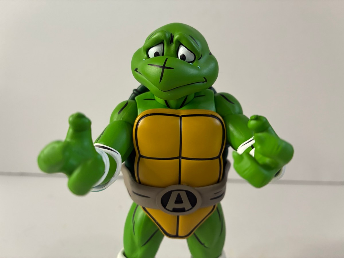
You can’t have a Lenny without a Carl.

Since the line isn’t anything amazing, I’m not that upset if it’s dying an early death. I have a pretty sizable display as it is, but there was one hole that was really bothing me. In the third wave of the line, we got a Lenny. Wave four brought Carl, only I could never find Carl. Wave 4 never appeared at retail near me that I ever saw. I was able to snag Barney off of Target’s website in a blink and you’ll miss it moment. I stalked online retailers hoping they would eventually get the wave in, but it never happened. Big Bad and other retailers got the fifth wave, but I never saw the fourth one. Also included in that wave was Bumblebee Man, and even though he’s far from an essential character, the figure looked like one of the better ones so I was hoping to get a chance to buy it. As the weeks and months dragged on though, it started to look bad for the Jakks line. I don’t know if it’s been cancelled or what, but I felt like if I didn’t get Carl and Bumblebee Man now the price would only go up. To eBay I went where I did find both from the same seller for about $18 a piece. I hate paying over MSRP on what is a pretty basic line, but I at least didn’t have to go well beyond it in this case.
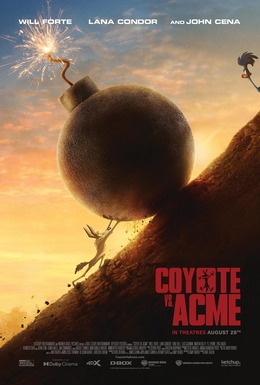
Krusty is the only one who really pairs with Bumblebee Man.

The long preamble here is to cover for the fact that with both figures there isn’t much to talk about. These are very basic figures with just a few accessories between the two. Carl stands at about 5″ to the tip of his hair while Bumblebee Man is about 4.5″ to the top of his head. Both figures are comprised almost entirely of colored plastic. Even Bumblebee Man’s torso is alternating black and yellow strips of plastic to create his iconic outfit. The only paint is reserved for Bumblebee Man’s antenna tips, the little circles on his inner shoe and the eyeballs and eyebrows. Carl doesn’t have eyebrows so it’s just eyeballs for him. The end result is you have figures that are very durable and won’t have any paint transfer issues, but they are quite shiny and have that plasticky look to them. I’d love to know if anyone has tried hitting these with a matte coat as Carl’s face is pretty bad. I could try it myself, though I also don’t want them to end up looking worse. Since there’s no paint on the plastic, the matte finish could wash them out a bit. Apart from that though, they do look pretty on-model. Carl is perhaps the lesser of the two (even though I wanted him more) just because his design isn’t as 3D friendly. He looks better from the side or a 3/4 angle, but it’s definitely not perfect. Bumblebee Man, being more of a rounder design, translates quite well and he’s one of the most on-model figures in the line. He also has transparent wings which look great and I like his slightly depressed facial expression.

Accessories are minimal, but Carl has two and Bumblebee Man one. For Carl, he has a cup of coffee with a red stirrer in it. It fits in his right hand and looks fine. His left hand is a tighter grip and it’s for his lunchbox. Since Jakks probably wanted to stay away from beer references, it would appear the approach to both Lenny and Carl (and Barney too) was to make them Homer’s lunch buddies. It’s fine and I can’t think of a better accessory than the lunchbox that isn’t a beer so why not? As for Bumblebee Man, he comes with a video camera which is on a tripod. It looks great, but sadly features zero articulation. I was a little surprised by this as there are places where it’s keyed in that could have been ball sockets, but oh well. At least it won’t lose its shape. A giant mouse trap would have also been acceptable, provided it could have got a secure grip on Bumblebee Man’s ass.

“How ’bout I show you my enchanted jock strap!”

Articulation for these two is what you would expect of the line: head swivel, shoulder ball hinge, bicep swivel, elbow hinge, wrist hinge and swivel, waist ball, ball socket hips, hinged knee, ankle swivel. The ankles feel like ball pegs so they basically wiggle a bit in all directions, but it’s not a substitute for a proper hinge and rocker setup. Bumblebee Man also gets a thigh swivel where his legs meet his shorts and his wings are attached via ball pegs so they get some decent range, but nothing extravagant. The figures have a bit of a loose feel to them, especially in the legs, but they’re so light that they don’t have trouble standing. The articulation isn’t going to allow for a ton of poses and the figures are further limited by the one facial expression they’re stuck with. It’s fine especially for the price (which should have been 12-15 bucks) and certainly better than the old Playmates line.

“Hey, what happened to all the donuts?” “Ah, Homer took them all into the bathroom again.”

Carl and Bumblebee Man are not flashy, but they raise the profile of the line slightly. Carl via his importance to Homer, Lenny, Barney, and Moe and Bumblebee Man just for how faithful he looks compared with the character in the show. If the line were to continue, I don’t know if Homer’s group really needs any of the other bar flies. Maybe a Grimey? Bumblebee Man pairs with Krusty and a Sideshow Mel or Kent Brockman would fit well into the Channel 6 crew. Will any of that see the light of day in the 5″ line? I don’t know. The smaller 2.5″ line seems to be going somewhat strong and there is a Mel included in it. Perhaps Jakks has found that form factor is more popular (it lends itself well to play sets and vehicles) and intends to focus its resources on that. There is a Bart as The Fly coming out soon in the deluxe line as yet another Treehouse of Horror representative, but I’m not as interested in those (they tend to have annoying gimmicks built in). I guess we’ll see what the future holds, but for now, my Simpsons collection from Jakks is pretty solid. It’s not a figure line that I love, but it’s an affordable way to get a pretty large collection of the many characters who populate Springfield. And given how big that cast is, just existing and being affordable is a pretty big deal.

For more Simpsons from Jakks Pacific, check out these:

Jakks Pacific The Simpsons Stupid Sexy Flanders

There’s some mild debate about the “Golden Era” of The Simpsons, but most seem to narrow it down to seasons three through eight. A lot of that period saw the show do well and get mined for talent on the writing staff. It also coincided with the show becoming eligible for syndication and the daily…

Jakks Pacific The Simpsons Deluxe King Homer

These days, The Simpsons is as synonymous with Halloween as candy and costumes. Via its annual Treehouse of Horror installment, which returns October 19th this year, The Simpsons has contributed more to Halloween pop culture than any other entity in my lifetime. Other shows have had memorable Halloween offerings, but none have taken over the…

Jakks Pacific The Simpsons Waves 3, a bit of 4, and most of 5

One thing I wasn’t expecting for 2025 was that the hardest line to collect would be The Simpsons by Jakks Pacific. It’s a mass retail release so, if anything, I thought it would be pretty easy. My assumption has been proven wrong and I think it’s because this is a line that is trying to…